If you want to see just how polarized America's media and political landscape has become, you’d have a hard time finding something more compelling than Blue Feed, Red Feed from the Wall Street Journal.
The project shows the viewer two hypothetical Facebook news feeds — one that contains content from sources favored by very liberal Facebook users, and a second that contains content from sources favored by very conservative users — each of which contain vastly different takes on the same issue.
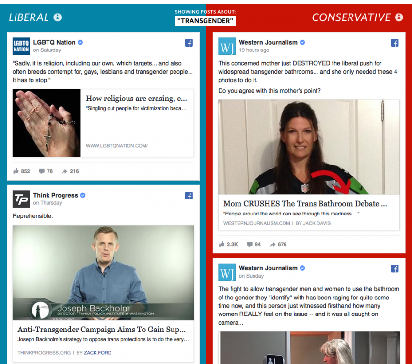
Blue Feed, Red Feed does what all quality journalism does — makes you feel and understand. It’s an impressive feat (though increasingly common) for a project that ignores the traditional emotional levers of journalism (poignant interviews, striking images, etc.) in favor data, an API, and clever design. It's also a great piece of evergreen content that can be updated repeatedly when new discussions arise: ISIS, the Orlando Shooting, gun control, and more.
Jon Keegan, a visual correspondent at the Wall Street Journal, built the project and talked to us about how the project was conceived and made. There are technical details down below, but you may also want to check out the project on GitHub or read the team's methodology.
Interview has been edited for clarity and length.
Ryan: How'd you come up with the idea for this project?
Jon Keegan: I was invited down to a workshop at University of Texas Austin — The Engaging News Project. In one of the little breakout sessions I recounted this anecdote of my wife who was basically ready to give up on Facebook because she was sick of it. And I was just like, “What are you talking about? Facebook is great.”
So she started to screenshot her Facebook feed and it was very different than mine. You know, everybody’s feed is made up of family members and everybody's got a branch of the family that isn’t maybe exactly inline with your politics.It really struck a chord with me. It was like this glimpse in to this other world.
So it really kind of struck a chord with me. It was like, “wow, they really are different.” Everybody has a different experience there and when you do get those little peeks, maybe it’s like a friend from highschool, it kind of catches you by surprise. It’s like this glimpse in to this other world.
So you’d been looking at this for a while, it wasn't in response to Gizmodo's piece on Facebook bias?
Well, we were close to publishing and then the Gizmodo story created some urgency. We were originally planning on the end of May.
(Bias) wasn’t exactly what we were talking about, but it certainly made everyone start talking about Facebook’s roll in the news, which is a very important conversation. Because like it or not Facebook is a big part of everyone’s life now.
Tell me about the data.
For a long time the data just didn’t exist. Pew had this great study out last year where they analyzed behaviors of different groups of people on the political spectrum and they found that liberals and conservatives react differently when they encounter counter-attitudinal content.
Liberals are more likely to un-friend someone when they see something that challenges their view; conservatives are less
likely to have those friends in the first place.Liberals are more likely to un-friend someone when they see something that challenges their view; conservatives are less likely to have those friends in the first place.
The Pew data was interesting, but it wasn’t quite as broad and powerful as the Facebook data we used.
Facebook studied 10.1 million users over six months and they’ve got a good sense of what people who are absolutely at a particular place on the political spectrum share and where the content comes from.
So how does your project work?
I have to back up a little to give you the break down (of the data) … over the course of six months Facebook looked at people who shared content and they looked at every link for content that was shared.
The first thing they did was they broke people into five buckets — very conservative, conservative, neutral, liberal, and very liberal — with some kind of machine learning and analyzed the way people described themselves in their profile.
As people shared content, Facebook assigned an alignment score to each URL based on what percentage of those people from those five buckets shared the same URL. So you might have one article and say, “80 percent of the people who shared this were from the very conservative bucket.”
So then they said, “let’s take a step back and look at all these links by domain.” Then they took those (domains) and put them into buckets. So you could say for a site like Mother Jones, “90 percent of the articles shared from Mother Jones were shared by people in the very liberal bucket.”We don't want to simplify this. We're not saying, 'This is what liberals see and this is what conservatives see.'
What we did at the Wall Street Journal was focus on and present the sources that had a majority of very liberal users sharing the content and a majority of very conservative users sharing the content.
By doing that, you're getting this very unrealistic view. We don't want to simplify this. We're not saying, "This is what liberals see and this is what conservatives see." We’re saying that these are sources that millions of real people who identify as very liberal and people who identify as very conservative shared a lot of content from these sources.
Using those lists of sources we now have a tool that we can use as a lens on the current news.
At the Wall Street Journal, we're pulling down recent news every hour from all of these sources. The final list of sources is about 130 and the reason it's smaller than the list Facebook created (which is 500 strong) is that we left out things like Twitter or YouTube that were kind of general channels that weren't of one place on the political spectrum.
And we also only included ones that had a following of 100,000 or more. And of course we only looked at ones that were a majority very liberal or very conservative.
So once you had the data how'd you go about designing the presentation of the piece?
The one thing I've found in my projects, because I'm kind of a one man band, is that they're most successful when I pick a singular idea and I resist all urges to add a lot of extra features to it. I think the singular focus of the idea of having the blue feed next to the red feed was the thing that we tried very hard to stay true to. That was the idea from the beginning.
Once I had the prototype working it was an amazing moment to finally see this because I had waited years to see what this would finally look like. And it didn't disappoint.

At first we didn't have the topics in there and it quickly became clear that it was very noisy and didn’t really support the thing we wanted to achieve with this. By using topics to filter it's much more focused and it illustrates that contrast I think in a much better way.
This isn't any kind of indictment of Facebook here. There are many different areas in our technology world today that we have this kind of hyper-personalization. This is just one place where I think the illustration can be best made.
So you tap into the FB graph API? And that's purely to pull down the stories to create an example of what an extreme feed might look like?
We have the public Facebook pages of each of these sources. All we do is grab the permalink URL, which is basically a URL for an individual post. And we grab the most recent posts each hour. We use those IDs to use Facebook’s embed tool. It’s not the most efficient thing for a web application. It's actually kind of heavy and clunky.
We could've used the API to spit this out any way we wanted to, but we thought it was really important to present this exactly the it is on FB. We didn't want to change or interpret the posts in any way. We basically wanted to show just exactly what we were getting without any interference.
Can you walk me through some of the tools you used and when you used them?
The other thing about my work is I'm a totally OK programmer. I'm no technical whiz. My web applications are usually very basic. This is a very simple project. There's not really a lot of analysis here.
I basically gathered all the public Facebook profiles, the Facebook IDs, which are not hard to grab from any page and I made a big spreadsheet that had the original source data.The other thing about my work is I'm a totally OK programmer. I'm no technical whiz.
I used Node.js to use the Facebook Graph API to make the requests and gather the data, which saved to a MySQL database. Once we have stuff in MySQL we do a simple keyword search on the contents of the stories that we have in the database, and that spits out some JSON, which is returned to the user. There's not really any complex code here.
It's a simple project and that's what the idea was from the beginning.
About the author
