Posts

Archive of posts with the tag

  • How WSJ used data and design to show Americans their polarized politics and media

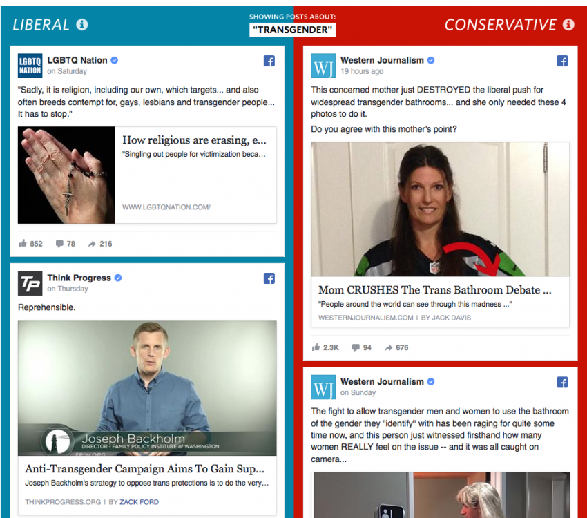
    If you want to see just how polarized America's media and political landscape has become, you’d have a hard time finding something more compelling than Blue Feed, Red Feed from the Wall Street Journal. The project shows the viewer two hypothetical Facebook news feeds — one that contains content from sources favored by very liberal Facebook users, and a second that contains content from sources favored by very conservative users — each of which contain...

    Continue Reading

  • NICAR 2015: Finding the elusive data/prose sweet spot

    Before I become a good data journalist, even an adept data journalist, there is a skill I really need to nail down: balancing data and anecdotes in an easy-to-understand narrative. Super simple stuff, right? Wrong. It’s a skill that I was drilled and tested on in a handful of courses at Medill, but I don’t feel I've reached the sweet-spot where numbers are present, yet not boring facts that most readers skip. Coming into NICAR...

    Continue Reading

subscribe via RSS