As streaming develops into the latest age of entertainment, how are interfaces and layouts being designed to prioritize user experience and accessibility?
The Covid-19 pandemic accelerated streaming services becoming the dominant form of entertainment. There are a handful of new platforms, each with thousands of hours of content, but not much change or differentiation in the user journeys. For the most part, everywhere from Netflix to illegal streaming platforms use similar video streaming UX standards, and haven’t radically changed over the last decade.
As a mega-consumer of content, I’ve always been interested in how each platform and its affordances change the experience of consuming its content.This spring, I’ve examined different topics related to UX Design and Entertainment, combining my passions for human-centered design and media studies while building skills in design, prototyping, and research
My exploration of interactivity in entertainment began with the “pre-streaming age,” which for our current discussion just refers to the period from the mid-90s to the early 2010s. This age was dominated by physical media entertainment including the advent of the DVD menu.
I quickly realized why so many of my peers are nostalgic for DVD menus. DVDs were some of the first interfaces we as Gen Z interacted with. We learned on our own, but especially for content aimed and directed at children, the space of the DVD menu allowed for content creators to have fun with things like layouts and interactives, hiding easter eggs, including games, and more. I will never forget how X-Men: The Last Stand menu let users choose between the X-Men or the Mutant Brotherhood, setting the stakes of the story before you even press play.
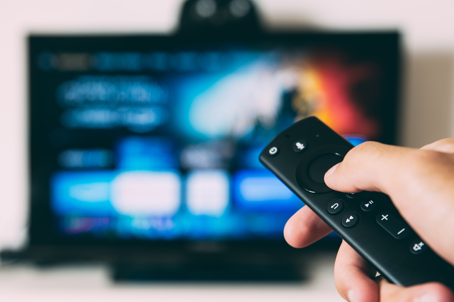
These layouts are constrained by the limited input options. A remote often only has 5 inputs, 4 directional, and the 5th to select your choice. Due to this, all DVD menus would operate on an indication system having to ensure users knew which option they were currently on, leading to contrasting colors of text, underlines, outlines and more, which sometimes didn’t work as effectively as intended.
In his article “DVD Menu Design: The Failures of Web Design Recreated Yet Again” design titan Don Norman lists seven rules that DVD menus should adhere to in order to be more user-friendly. While his list is over 20 years old, I agree that some things like accessibility and development of industry standards are missing from this medium.
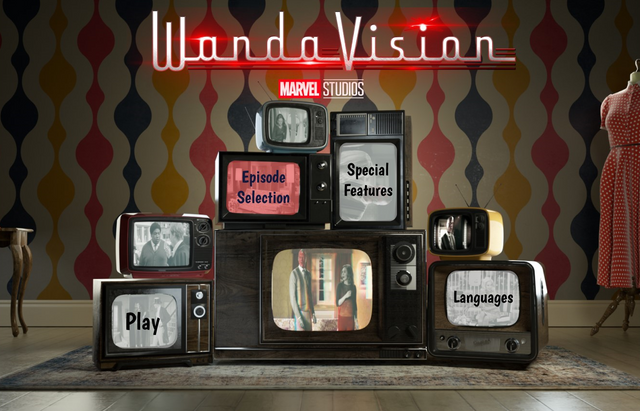
As a design challenge, I mocked up what whimsical DVD menus would look like for modern-day content and streaming platforms. For these mini-projects on Bridgerton and WandaVision, I tried to combine categorical standards of DVD menus with the technological affordances of today to create these mockups in Figma.

Next I looked deeper into Subtitles as an intro to accessibility and the many ways that streaming platforms can make themselves for everyone. As someone who occasionally uses subtitles, I knew that for some people subtitles were a necessary and important aspect of consuming content.
As I began my research, it became clear that though subtitles often offer foreign language transcription, depending on the content and the service, you might not be able to have subtitles in your language of choice. While most services offer some of the widely spoken languages in the world on nearly every title, there are noticeable absences of major global languages like Hindi and Arabic. I know it may look different if I were accessing Netflix from different locations, it’s interesting to notice what services decide to offer in one of the largest subscriber bases.
Subtitles are one of the most prevalent accessibility considerations within media, and are often how foreign viewers consume American content. As streaming became more global with the massive success of titles like Parasite, Money Heist, and Squid Game, many Americans are now frequent users of subtitles.
Looking into research done on subtitles, a lot of literature is focused on making sure that the translations are accurate and not distracting from the content that already exists. An aspect that I couldn’t find a ton of research on was the visual accessibility of subtitles. Across my own analysis of what different services offered, only a few allowed me to have different sizes/colors/fonts for subtitles which is a key to allowing everyone to take part in media consumption.
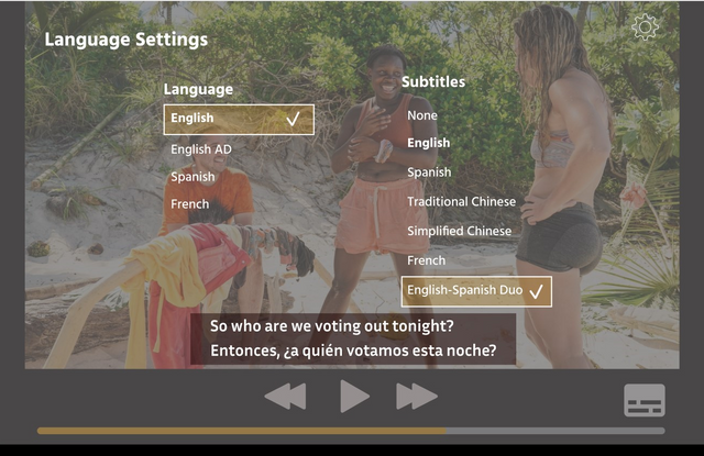
Below, you’ll see a mockup of what an “ideal” subtitle menu layout could look like. I combined some industry standards with ideas of my own, including a potential duo subtitle layout, with multiple languages to help language learners. This idea was inspired by a talk with one of my friends who often watches content with their mom and while they both like subtitles, they can never agree on which language to have it set to.
Lastly, I wanted to get a better understanding of how the same platforms look and work across different screens. I’m always watching something on my phone, and usually multi-tasking while I’m cooking, cleaning, or doing work, but I know that everyone has a different preferred way to consume content. My key insight was that each screen provides different UX design affordances.
While you can access streaming services onto a multitude of different screens, the main three I looked at are smartphone apps, computer browser windows, and televisions. More important than screen size is the type of input, ranging from touch screens on phones, to computer cursors, and remotes for television.
Like DVD menus, the complexity of an interactive environment should be determined by the input constraints to create a smoother user experience. A great example of this concept is how video games always map button inputs so that users are aware of their capabilities!
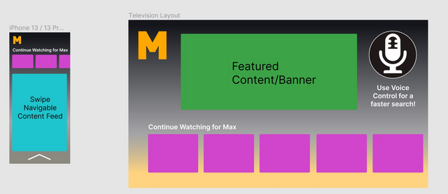
Despite different input methods, all of these interfaces will look and work similarly to create a cohesive brand experience across different screens. For my weekly design challenge, I tried to come up with some conceptually distinct wireframe ideas to best highlight the different screens we most often consume media.
First, I wanted to address the television screen, despite its lofty goal of being an at-home theater experience, it is often being weighed down by the limited inputs capable via remote. If you’ve ever tried having to spell something out letter by letter on a tv screen, you understand. After toying with various ideas of voice control, to make the tv screen experience user-friendly, the actual tv interface should be simpler, and a cross-play system should be implemented where a streaming app on a phone can serve as a remote control.
For the touchscreen app, one aspect of interaction that no streaming platform has implemented is swiping. With the rise of Tinder and TikTok, swiping is not only a normalized action. Swiping would enable more promotional content with creators, actors, and more that are usually stored on third-party platforms like YouTube or TikTok.
This project has opened my eyes to new potentials for innovation and design within an industry that is conceptually homogeneous for the majority of its interfaces. With concerns about the future of streaming services and not being able to grow subscribership indefinitely, competition relies on all aspects of a user’s experience, not solely content, but interactions, ads, subtitles, and so many more.
Max Johnson is an undergraduate senior in the School of Communication at Northwestern University. This story is part of “Interactivity in Media: UX Design in Entertainment” Max’s independent research study within the Knight Lab.
Article image by Glenn Carstens-Peters used under Unsplash license (Unsplash)
About the author

