On Friday, February 21, 2014, two members of a Southern California family dynasty were indicted on a series of political corruption charges, including tax fraud, money laundering, and bribery. Two members of that family — Tom Calderon, a consultant and a former assemblyman, and Ron Calderon, a state senator — would surrender themselves by the following Monday, both pleading not guilty to the charges. Tied to their alleged wrongdoings was an extensive network of people and organizations — ranging from education to the water industry.
In the weeks before that Friday, Paige St. John, a Los Angles Times investigative reporter, began detailing the family’s connections using Microsoft Excel and its NodeXL extension, a popular network analysis platform which can be employed for simultaneous mathematical and visual analytics. The publication wanted to produce an interactive graphic with that data in order to visually guide readers through the complexities of The Calderon Family’s Connections. An intern, Byron Lutz, was tasked with bringing it to life.
As part of our research on social network analysis, Anne, Anushka and I asked Lutz if he would tell us more about how he had gone about this work. For the past few months, we've been designing technology that would facilitate production of similar infographics and want to understand that process from potential users’ point-of-view. Here's what Lutz had to share.

Were you given a dataset, or did you have to gather the information manually?
One of the main reporters on the topic, Paige St. John, had been keeping track in an Excel spreadsheet of the connections between the Calderon family and the different players in the story. She kept talking about NodeXL and handed me that spreadsheet. The L.A. Times really wanted to publish a network graph that worked well. I downloaded NodeXL and played around a little bit, but I couldn’t figure out anything from her spreadsheet. It was huge, and most of it didn’t have anything to do with the story.
One cool purpose of the graphic was to show how the brothers were connected to a bunch of different issues, but you couldn’t decipher that from the spreadsheet because there was so much irrelevant information in it.
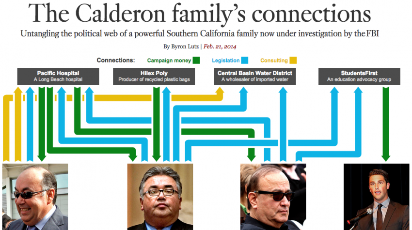
Instead, I went through all of the L.A. Times’ archives on the Calderon family and came up with a list of most important issues. The top of the graphic has the four different organizations that the Calderon family had ties with, and at the bottom are the three brothers and one son. I went through a few more times to see how each person was connected with each one. I only wanted to publish ones where multiple people were connected with the same organization. There were other possibly interesting connections, but they weren’t relevant; some of the people were like “This is this person’s wife.” So I did have that NodeXL spreadsheet, but it wasn’t useful for me, although the reporter found it useful for searching through to see if something came up.
Did the story come to you first, or did it emerge as you laid the graph out?
I had no idea what I wanted to highlight at first. They kind of threw me this story and said, “We want this visualization. A network visualization would be really cool.” I was an intern on the data team. We were just looking for a project, and this was one of those projects they had been wanting to work on for a while. The first step was going through all the different stories figuring out what are the important things to show. And then I met with the graphics department director and a few other people, and we came up with this visualization.
The smaller network graphs that are there throughout the piece... were a tool for me to understand the story.
For me, the diagrams came first for everything. The story on the right side were sentences from older LA Times stories. They were really confusing to read through, because AP Style says to refer to people by their last names, which gets really confusing when everyone has the same last name. The smaller network graphs that are there throughout the piece, I pulled those together as I was reading the stories to keep track. They were a tool for me to understand the story. Then I put together the text and wrote a few more sentences.
The set of four organizations I was focusing on changed quite a bit. I would always read a little story here and a brief there and read about other organizations that were important. There was a bunch of information and it was hard to figure out what was relevant, what helped me tell the story, and what was worth saying. Plus, this was going on while the family was being investigated, so it wasn’t completely clear as to what information was actually true.
How long it take you to make this?
I think it was about two to three weeks, maybe more.
What was the logic in the visual ordering of the players and the organizations?
The order was based on what looked the best. I laid it out on paper and this was the structure that was the least confusing and the easiest to follow. Tom Calderon is really connected to Pacific Hospital, and Ron Calderon is really connected to Pacific and Hilex Poly, so it made sense to have them across from each other, then the arrows didn’t have to go all the way across the graph. I just played with different iterations and this one seemed to work well. I tried to maximize the number of vertical links and minimize the number of lines criss-crossing. It gets really confusing if the lines criss-cross. Sometimes the lines get hidden by other lines completely.
How did you decide on the three classifications of links that are presented?
There were quite a few more connection types when we began. To me, the most important connections were when, for example, you could see campaign money going somewhere and a legislative action coming back the other direction. Then I was trying to highlight how campaign money related to a politician’s use of legislation. Consulting was a weird one — one of the brothers was a consultant — but it was still services for an organization.
How did you come up with the scroll design?
The main thing we decided as a team was the top visualization. The thing as you scroll down, I was kind of playing with it. I wanted a graphic that wasn’t a movie, but was still animated as you went through the story, and also was interactive so you could click on any of the people or the links and see what was going on with them. I wanted to see how that worked, and I liked how it worked.
I wasn’t a big fan of things where the reader had to click play, sit back and watch. I wanted something where you could scroll to any part of it and explore however much you want without having to wait a set time.
Is there anything you wish you had done differently?
It’s outdated now, and it would’ve been nice to build in some way to update it or make changes easily. In the month or two after, whenever any story about this family was published, they would link to this graphic. But they’re not anymore because it’s not updated, and everything is so customized so people there don’t really know how to update it.
It would’ve been good to make it and and decide for a bit to see if everything looked right, but we wanted to push it out as soon as possible because it was happening, and it was breaking news.
Insights
In our research, we have constantly referred to this visualization as a prime example of “data that come from a story” rather than a “story that comes from data.” With four people and four organizations, the complexity of the main diagram primarily comes from the 15 links between people and entities (each of which is classified as campaign money, legislation, or consulting). Our assumption has been that such a structure could not have come from data alone, because network data always contains many more nodes and rarely contains numerous link types. Hence the diagram must have been used to organize a story that was already in a reporter’s mind, as opposed to a story that emerged from a structured dataset, which Lutz confirmed.
In the end, we might reach a few generalizable conclusions from this conversation as we think deeper about what our tool should do:
First, there's a need for both analysis and presentation. Lutz's visualization was not made purely to communicate information; it also served as a tool for Lutz to organize the information as he was collecting and filtering it so that he could quickly gain insight into what the story should be.
Second, if we can build technology that allows a journalist to visually organize information that is changing, it should also be able to handle necessary edits post-publication. It should allow for easy addition and removal of data as stories or data evolves while maintaining visual consistency for readers.
Third, there is a need for network vizualization tools. The design process took Lutz about three weeks, which helps convince us that he and others would benefit from an easy-to-use technical solution.
About the author