Before I become a good data journalist, even an adept data journalist, there is a skill I really need to nail down: balancing data and anecdotes in an easy-to-understand narrative. Super simple stuff, right? Wrong. It’s a skill that I was drilled and tested on in a handful of courses at Medill, but I don’t feel I've reached the sweet-spot where numbers are present, yet not boring facts that most readers skip.
Coming into NICAR 2015, I was really hoping to get help with this.
Only one day into the conference, I had all my questions answered, and a million more opened and unresolved.
Before I even got a chance to address the finer points of the balancing act, I attended a talk by ProPublica’s Scott Klein on the history of data visualization. Surprisingly, and completely unsurprisingly, his talk prodded at my issue, as it existed long before I was able to think about it.
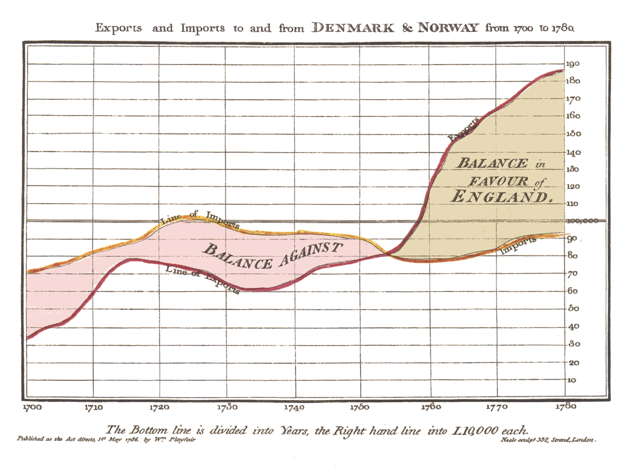
Ever since William Playfair line, pie and bar charts in the late 1700s, journalists have been trying their hardest to use them in data-heavy stories. From the first line chart in an 1842 edition of the Bombay Times, to extensive mapping and pie charting stemming from the 1870 U.S. Census, and the Wall Street Journal’s first commodities chart in 1921, journalists have been experimenting with the possibilities and occasionally hitting gold.
Klein’s talk was incredibly interesting, and I came away with a few more books on my ever-growing reading list, but there was a bigger take away: visualizations of data have never been considered intuitive.
“We take this for granted, we would assume that any child would know how to read a line chart, but in 1849 they couldn't,” Klein said. “Every graphic I just showed has a florid description on how to read it. It’s not intrinsic.” Klein explained that you can use design hierarchy to guide the reader, but sometimes, no matter how simple you think your visualization is, you have to straight up tell readers how to read the data.
So, before I got a chance to really address my questions, Klein threw a huge wrench in my thought process. If I cannot assume that new visualization techniques are intuitive, where is the line between those that can be taught and those that cannot? I’m going to spoil this right now: I still don’t have the answer. But a panel I attended later in the day helped me chip away at it.
Right off the bat, the session on ‘Humanizing Numbers’ promised to be rewarding.
“What is a number?” New York Times’ Ron Nixon asked the audience, semi-rhetorically. “Numbers are simply numeric representation of things in the real world.” This might not comfort a high school calculus student, but it really makes sense in journalism.
The numbers we work with are never just numbers. They are people, animals, violence, or environmental issues. For a story to really work, the face behind the number needs to be found and highlighted, because, as panel member Katie Park of The Washington Post pointed out, a number “doesn't make you feel anything. It doesn't let you know anything about the people who make up the data.”
As Nikole Hannah-Jones, a panel member from ProPublica, puts it, journalists love the data because it proves a story exists. But readers don’t care about the full data. If they did, they would go out and find it themselves. By drawing out the face behind the number, you’re not just avoiding the glazed-eye effect, you’re giving the reader a reason to go on to the next paragraph. A story made entirely of numbers will send readers running, but a story based entirely on numbers might actually keep them around.
This is fairly easy to comprehend in the abstract, but when it comes to actual implementation there is room for extensive experimentation. Park has used a number of methods to humanize her numbers. She said her sketches might start out as simple bar charts, but they will often end with points replaced with the names of victims, or forty unique children’s onesies instead of a simpler histogram repeated forty times.
She suggests keeping the idea behind the visualization simple, and adding layers to make it hit home with the reader. Simple variations on well-known techniques means you can have a really powerful visualization without a tedious explanation on how to read it.
Even still, Park said she finds times where her attempts are too much. “Sometimes you get to the point where a data-visualization just doesn't tell the story, sometimes a simple picture is all the visualization that is needed," she said.
In other words, just because it’s a data story doesn't mean you get to skimp out on the intense reporting, lengthy interviews, road trips, and photography that make any story great.
“Humanizing numbers is a reporting challenge rather than a story challenge,” Ryan Gabrielson, another ProPublica panel member pointed out. You use the data to find the story, not as the story itself.
“Too often we settle for phone calls, settle for the best answer they can give off the top of their head,” Gabrielson added. “Always go to the paper and the people that underlie the data.”
On the other extreme, Gabrielson pointed out that “too often when we think of humanizing, we think about who is the lead anecdote.” This is where the middle ground exists: between stories that reads like annual reports and anecdote driven narratives that fail to consider the data whatsoever. Herein lies that sweet-spot.
There may not be a universal sweet-spot between the two, but there is one for every story. It’s where the data leads you to a person or an experience that represents the archetype of the data. It’s where the numbers you use are sparse and powerful. It’s where your visualizations are simple, clean, humanized, and either intuitive or simply explained.
The difference between knowing this balance exists and executing it is immense. There are hundreds of editorial decisions between starting a story and releasing a polished project, and any one of them can lead you astray. I make no claim to being able to navigate this path successfully, and many of my data stories have failed miserably because I find it very difficult to drop my excitement for the numbers. But you can tell when a team pulls it off, and not just because the story rakes in awards. In the words of Supreme Court Justice Potter Stewart, “I know it when I see it.”
About the author