Last week I wrote about how news organizations use A/B testing to help iterate on design elements such as page layout and headline writing-style in order to increase reader engagement. The technique provides essential information about what a reader is doing, but it does have limitations.
“When you’re only looking at metrics you see the what, but you don’t see the why,” said Steve Mulder, director of user experience and analytics at NPR Digital Services.
A/B tests lack context. In designing media products such as a homepage, story, or app, the motivations for user-behavior are as important as the behavior itself. Digital analytics may show that a reader is spending a lot of time on a story page, but not why. Is the story interesting? Confusing? Hard to navigate?
Observing people interact with a news product can help designers create better experiences for them. Observation can take various forms including eye-tracking and remote testing, but one-on-one observations are particularly exciting for newsrooms because they can be done quickly, inexpensively and they are informative.
Here’s how different news organizations have used one-on-one observations to improve specific products.
Washington Post
In the summer of 2012 The Washington Post launched a significantly updated version of its iPhone app. Before launching the new app, director of mobile Julia Beizer and her team watched readers use it.
It became clear that some of the new features were not intuitive to everyone. One particularly problematic feature was a customizable bookmarks bar.
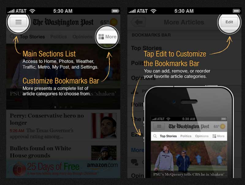
To help readers figure out these new features, the team added “tool tips” screens (see image above). While Beizer acknowledges that these screens can be annoying and that not everyone might read them, they allowed the Post to keep and highlight a new app feature it was proud of.
Boston Globe mobile app
The Boston Globe saw a similar problem when designing its new app in June 2013, but found a different solution.
In an early beta interface of the mobile app (the screen on the left below) readers could pick which sections and in what order they would appear on their homepage. For example, if a reader only wanted to see arts and lifestyle, she could choose to display only those sections on the homepage and arrange their order (arts or lifestyle stories first).
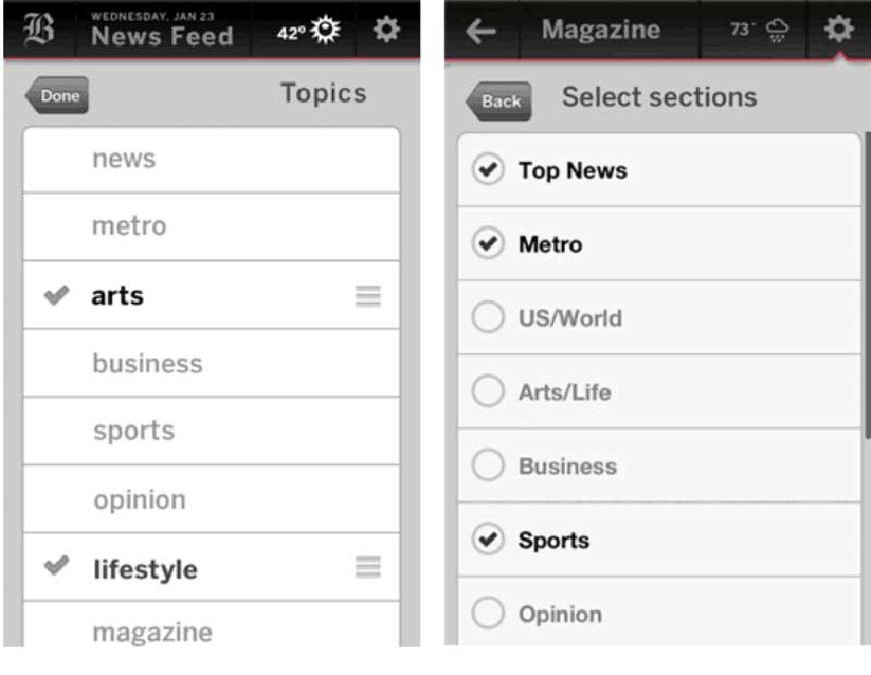
Testing showed that no one knew what the sorting icon (the horizontal lines stacked on top of each other) meant and that none of the users were re-sorting the sections, according to Damon Kiesow, senior product manager at the Boston Globe. Instead of adding a feature like explanatory text or tool tips screens, the Globe got rid of the problematic feature.
“UX testing through the development process is more about removing features and removing obstacles than adding features,” Kiesow said.
The process was simplified in the next iteration (the screen on the right) to eliminate this problem. Instead of allowing people to sort the homepage sections and the order that the stories appear in, readers could select which sections they wanted and the stories would automatically show up in reverse chronological order.
The homepage of the app went from being an editorially ordered page to a most-recent stream of stories. Kiesow believes that this was preferable for a particular audience accustomed to news feeds and updates from services like Twitter and Facebook, in which users are shown the latest information and not necessarily what they are most interested in.
NPR Apps
Brian Boyer’s team at NPR is working on relatively small projects that take around a week to build. While there is sometimes a rigorous usability test approach, it’s more often “off-the-cuff," he said. This could mean asking people walking by for help or going to someone’s office and having them test a project.
NPR’s Fire Forecast is a map app that “shows current large wildfires and forecast burning conditions in the lower 48 states.”
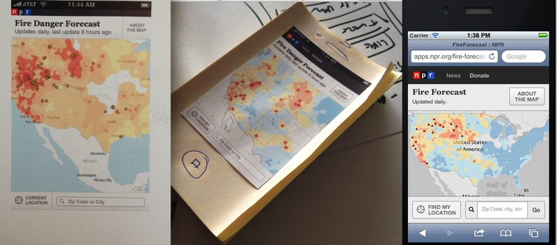
In early iterations (far left image) buttons were flat and the search box had no “go” button. Boyer and his team tested the app with different people and learned two important lessons.
First, it was evident that people were not interacting with the buttons, because they were not designed to look like actual buttons. In response, the team defaulted toward standard-looking controls that people recognized.
“The second we popped those buttons out, people immediately knew what to do,” Boyer said.
Second, the search box on a phone acts like a submit form in which you can type and then hit search. There was no obvious way to take action without a “go” box, so one was added in. These changes helped readers take full advantage of the app’s features.
What I’ve learned so far
Exposing products to users early on can help a news organization make sure that they are releasing and developing them with audience focus. One-on-one user-testing can help product development teams make informed decisions around what functions or designs to add or eliminate to aid in the larger mission of getting content to reader.
As Alex Wright, former director of user experience and product research at The New York Times explains, “It’s not really about testing the editorial content, but about figuring out the most effective way to deliver that content, and helping users find stories that are interesting to them.”
As evident from the examples above, the formality of the test doesn’t necessarily correlate to how informative it is. This means that whether you can afford to hire a firm to help test products, or if you can only dip into a local coffee shop to run through some task analysis with a willing participant, there’s valuable insight to be gained. After all, the NPR News Apps team didn’t need to hire a company to gain insight into the fact that people were having trouble figuring out how to conduct a search.
Last week I wrote that “design decisions can and should be rooted in data.” The quantitative data obtained from digital analytics works hand-in-hand with the qualitative data gathered through the kind of observational research and one-on-one testing that news organizations are doing. These two strategies for usability testing work together as on-going techniques for improving products.
When designing for the user-experience the why something is happening of qualitative data is just as important as the what that quantitative data shows.
About the author