Back in November I had a minor journalism crisis, questioning journalism’s impact on society and the business models that are trying to sustain news organizations. This prompted me to look into other ways that people interested in social impact were developing and organizing businesses.
Long story short, I applied and was accepted into a 6-month program at Northwestern’s Kellogg School of Management called NUvention Impact. It’s an interdisciplinary social entrepreneurship program that gives Northwestern graduate students the opportunity to “design and launch market-based ventures that address unmet societal and environmental needs.”
The program helped me recognize that design firms such as IDEO have developed frameworks that can be used to address challenges facing the news industry. For example, IDEO has expertise in business design, which they use to help companies build sustainable business models and products that emphasize the importance of user-centered design. The Bold Italic, an online "magazine, shop and events hub” in San Francisco developed out of collaboration between IDEO and Gannett Co. More broadly, the program exposed me to user-research methods such as usability testing and A/B testing.
I’m not the first person to recognize this of course, but it was new to me and I was feeling excited. I started to think about the news industry differently and how I might start learning more. The search for like-minded people led me to the Knight Lab, where I’m working as part of a software development team while researching best practices across different industries that can be applied to journalism.
Over time, I’ve become interested in a user-research technique for websites called A/B testing. It’s a two-variant experiment that website designers often use to test a proposed change against a controlled, current design. Now, some people may hear “design” and think typography, color and “the art” of a presentation. For the purpose of this article, when I say design I am focused on the layout, presentation and/or the way a reader experiences a website.User-research methods like A/B testing help news organizations iterate on design elements such as page layout and headline writing style
User-research methods like A/B testing help news organizations iterate on design elements such as page layout and headline writing-style that help publishers meet their success metrics. Ideally, an A/B test isolates one variable on a web page — a photo, a headline, link placement, etc. — and allows editors to determine whether option A or option B is better at achieving a set measure of success, or goal.
The measure of success for a test varies depending on the metrics and goals of individual publishers. This test is typically used to measure business-side metrics. Commerce sites, for example, typically want users to buy more and they utilize this testing method to optimize a design or layout, that results in more users making a purchase.
News organizations can use the test to understand how readers are engaging with their websites. The goal of the test might be to increase user engagement, which can be measured by determining the layout, design treatment or writing style that results in more readers clicking and visiting a feature or increased usage of social sharing tools. These numbers typically translate to more page-views and advertising impressions.
From an editorial perspective, increasing reader engagement could correlate to growing an informed audience, which is often a news organization's mission. For example, if the test shows that readers are missing salient data in a story because they don’t bother to click into it, editors can use the test results to understand a more effective design treatment to get readers into the article.
I wanted to know if news organizations used these kinds of tests and, if so, how often, applied to what and what they would do with the data gathered. A few folks from different news organizations have helped me better understand how they have been using A/B testing, and its subsequent data, to inform their design decisions. Here’s how three organizations have used the technique to test assumptions and improve their designs:
The Huffington Post
The folks at The Huffington Post have used A/B tests to inform a number of editorial and design decisions — from writing headlines that generate more clicks to deciding where to place social media share buttons.
Data editor Andrei Scheinkman and programmer/journalist Aaron Bycoffe are part of a team that regularly use Google Events to A/B test different aspects of the site. They recently tested two versions of Twitter and Facebook share buttons to see which design resulted in more shares.
[caption id="" align="alignnone" width="800"]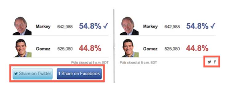 The Huffington Post found that bigger, clearer share buttons yielded more social media engagement.[/caption]
The first button design was big, bright and included a call to action. The second was smaller, gray and included only an icon.
Scheinkman said his team’s hope was that the quieter design would yield more shares, but the test showed that four times as many people interacted with the large colorful buttons as with the quieter ones.
The test and resulting data helped the designers choose the button that met the goals of both the user (sharing cool content) and the business (increasing engagement with users).
Vox Media
A few years ago Vox Media was working on redesigning StoryStream, an editorial tool that presents articles in a broader narrative by presenting readers multiple articles related to the same story together to help give readers context to ongoing narratives.
[caption id="" align="alignnone" width="800"] Vox Media tested the theory that introducing a design change to distinguish read and un-read articles would lead to more clicks.[/caption]
Vox’s chief product officer Trei Brundrett said his team used Google’s Web Optimizer tool—now Content Experiments — to test the assumption that a Gmail-like interface — which clearly indicates read and unread emails —would result in more second clicks into the StoryStream.
The control in this experiment didn’t introduce a style change to articles in StoryStream that readers clicked on. It kept them in a bold font. The variation introduced a style change for read articles, giving a regular font to read articles. Brundrett and his team quickly discovered that the design change didn’t increase clicks into more articles and the team abandoned the plan for style changes to read articles.
Brundrett and his team went with the design that matched their goals — increasing clicks into additional articles in StoryStream.
The Boston Globe
The Globe constantly tests a variety of page elements including layout and headline phrasing so that decisions can be rooted in facts and data, said vice president of digital products Jeff Moriarty.
[caption id="" align="alignnone" width="800"]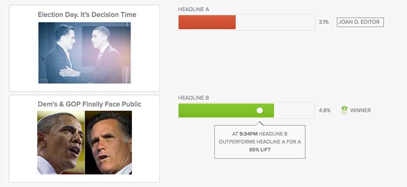 Sample screenshot of the Visual Revenue A/B testing tool.[/caption]
The paper runs A/B tests around headlines using Visual Revenue, a tool that uses predictive analytics and an editor’s guidance to help determine the best way to produce a homepage.
The paper recently tested two headlines:
“Pierce and Wilfork show off their Boston accents”
“Pierce, Wilfork show off their bad Boston accents”
The first headline yielded 12 percent more clicks. This may not seem like a large percent change but it adds up to thousands of clicks.
What I’ve learned so far
In addition to insight into how news organizations are using data as a design tool, I came across a few tools that are helping news organizations gain insight into how users are interacting with their websites: Dynamic Yield, Google Events, Visual Revenue, Optimizely, and Topsy.
Design decisions can and should be rooted in data. Good design can do more than satisfy the aesthetic preferences of a user. It can increase a user’s engagement with the content. In short, design is never done. News organizations should be constantly testing their websites to better achieve their goals of keeping users engaged and informed.
About the author

