As social media have become a regular part of daily life, people have wondered what they can learn about themselves and their communities from the millions of messages posted online—especially on Twitter, because it is so public and so conversational. Many projects in this space begin by selecting tweets for analysis based on who tweeted or specific terms used in the tweets. Students in our Fall 2012 Innovation in Journalism and Technology class wanted instead to explore what could be learned by grouping tweets based on their geolocation. Building on that first prototype, the Knight Lab staff has developed the idea a bit further, leading to today's release of Neighborhood Buzz.
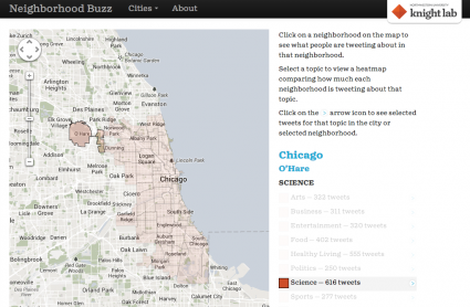
In short, Neighborhood Buzz is an experiment in summarizing the topics of conversation on Twitter by neighborhood in 20 cities across the country. Neighborhood Buzz continually collects tweets, assigns them to a neighborhood and categorizes them topically. When you visit a city page, Buzz shows you the number of geolocated tweets in that city in each category over the last week. If you click on a neighborhood on the map, the numbers adjust reflect tweets geolocated in that neighborhood. Or, you can click on a topical category in the list, which displays a heatmap overlaid on the city map showing how much each neighborhood tweets about that topic. (More on that below.) You can also click on the arrow next to each category to see a sampling of tweets in that category for the selected city or neighborhood.
The original student team focused on Chicago and used a simple mathematical algorithm (rounding to grid coordinates) to assign tweets to neighborhoods. While we were developing this new version of Neighborhood Buzz, the Code For America Louisville fellows released a fun project called Click that 'Hood. As part of that project, they've collected a trove of neighborhood maps for cities around the world. Their maps and our decision to use PostGIS for our database made it easy to add many more cities to the project. (Unfortunately for our friends outside the United States, for technical reasons involving Twitter's streaming API, we had to use a geographic filter that only processes tweets geocoded somewhere in the U.S.)
We started with all of the neighborhood maps collected by Click that 'Hood. After a little experimentation, we found that there just weren't enough geocoded tweets per neighborhood in many of the cities for statistical analysis. We looked at the totals and saw a pretty natural break after the top twenty cities, so we decided to limit our project to those. (Technically, we have 15 cities; four of the five boroughs of New York City; and Los Angeles County including neighborhoods of the city of Los Angeles).
Once we sort tweets into neighborhoods, we use a topical classifier to assign them to one of nine categories. The classifier provides a score for each category reflecting its "confidence" that the tweet belongs in that category. We assign the tweet to whichever category has the highest score.In developing Neighborhood Buzz to this point, we find two continuing challenges … tweets are simply hard to classify using traditional text analysis methods … only a very small number of tweets are geocoded.
In developing Neighborhood Buzz to this point, we find two continuing challenges. The primary problem is that tweets are simply hard to classify using traditional text analysis methods. They are chatty, full of abbreviations and slang, and of course, just short. About one-third of the tweets we attempt to classify don't get any scores at all, and so aren't shown in Buzz. Additionally, classifiers must be trained using labeled texts, and the texts we had available for this purpose were from a different category altogether (news stories). For these reasons, you'll sometimes see quirks such as the word 'party' often leading a tweet to be put in the 'politics' category.
Finally, at the current time only a very small number of tweets are geocoded. A couple of random samples indicate that about 1.5% of all tweets have a location associated with them. And many of those are geocoded because they are sent by a third-party service, such as FourSquare or Instagram, so it's a bit harder to say that we know what people are "talking about" in a certain neighborhood. (Also, Instagram's default text, "Just posted a photo," results in a disproportionate number of tweets being labeled about "Art.")
And, getting back to the heat map: any time one uses a heat map to summarize data points, it's easy to simply reproduce a population density map. Computing the per-neighborhood population was outside the scope of our project, and Twitter users are not evenly distributed among the general public. So, we looked for a different way to normalize the data. In our current implementation, we compute the percentage of all tweets in the given category that came from a given neighborhood. In practice, it's rare that any one neighborhood is the source of more than 20% of all tweets in a category, so the maps are often a fairly uniform color.
We’re releasing Neighborhood Buzz now so people can use it and tell us what they think. Our plans for future development will depend on what we hear. We've had some conversations internally about other approaches to aggregating and summarizing the tweets in a neighborhood. I'm sure we'll have other projects for which we’ll continue working on the general challenge of categorizing tweets, and some of those advances may make their way back into Buzz. In the meantime, try it and tell us what you think!
About the author