This week, Knight Lab is posting daily as we look back at 2012, taking a moment to call out some significant achievements, advances, or cool projects of the past year that move us just that much closer to saving journalism. Yesterday, Ryan Graff highlighted some of the storytelling that made 2012 great, delicately skirting a “Best of” list and instead noting some of the ideas that we thought were intriguing.
Today is dedicated to design and presentation as we try attempt to call out some of the projects, visualizations and visual journalism that rocked 2012. Like yesterday, this is not a "Best of" list, but simply a short post to acknowledge some of the more significant/experimental/intriguing pieces of work from the past year.
Inevitably, I have left a some amazing projects off of this list, so please feel free to add your "Hey Idiot, you forgot … " plus a link to additional stellar work in the comments below or on Twitter with the hashtag #newsinno12.
Product design
I am a total sucker for redesigns at the major news operations and both the USAToday.com and ChicagoTribune.com redesigns from this past year deserve some kudos.
A breath of fresh air, USAToday.com's new look is clearly aimed to be a more visual and flow-based experience, placing tremendous value on the effectiveness of visuals to keep users engaged.
 The new site feels more like a media experience and less like a traditional publication, yet still maintains their signature navigation and color schemes of the sections. Their new logo — a large circle in colors corresponding to a section/vertical — does a lot of work. It changes with the news, containing a photo or image that represents key stories of the day, serving as a quick-hit infographic.
I will be curious to see if the user-controls that allow a change from a grid display to a list display of story teases is deemed meaningful or successful. It will also be interesting to learn if the new design — somewhat obviously driven by a desire to give advertisers a new type of digital canvas — is successful by more traditional business measures.
 Mid-summer, it was nice to see The Chicago Tribune release a lighter, more airy design in the relaunch of their newly responsively-designed site. Their new aesthetic is more traditional, newspaper-ish, in nature: It’s neat. It’s clean. Nothing terribly risky. So, it was not surprising to learn that the primary driver for the redesign was described by Tribune executives as a first step toward putting up a pay wall.
 The NPR design team has had a busy, busy year. Early in the year, the Planet Money iPhone app was released and, in the second half of the year, it has been fun to follow the team's tweets as they rework the site templates for responsive interactivity. From Max Pfennighaus' play-by-play tweets to Patrick Cooper's encouraging team perspective, I love that NPR Design has kept us updated as they take on one behemoth of a redesign project, one asset-type at a time.
Finally, Ryan Pitt's team put out a new responsive app for their local guides that allows users to explore the Spokane, Wa. area through photos, maps and information. I particularly like the "save for offline use" feature and "this tour is good for walking/driving" indicator.
2012 campaign and election presentations
As Dan Sinker called it, "Election season is the Super Bowl for news-application teams. There isn’t a single developer at a US- or global-oriented news organization that hasn’t been bringing their A-game these last months." There was so much awesome, here are just a few of our favorite experiences:
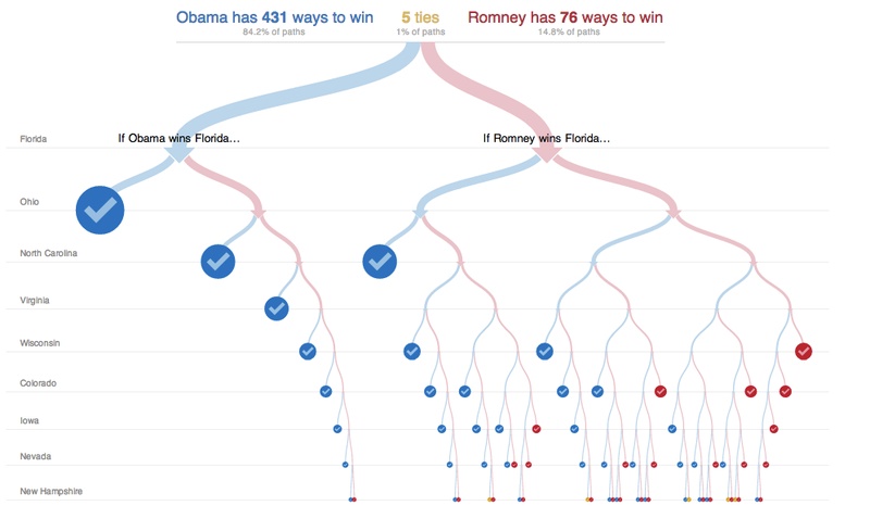
It's no surprise that the New York Times' Interactive News Team pulled off the most comprehensive campaign and results presentation. They even released an API with the campaign finance data. That said, Shan Carter and Mike Bostock's visual outcome explorer, 512 Paths to the White House, was by far the most innovative presentation approach to the electoral college calculator every news organization publishes every four years. The interactive tree design allows users to explore US Presidential election scenarios using battleground states as the organizing motif. Unfortunately, the first time I came to this project via Twitter and on my iPhone. I couldn't help but wish deeply it were designed mobile-friendly, though designing this presentation for a small viewport would have been a slightly different story , I suspect ... Still, this story is brilliant.
In case you missed it, Bostock wrote up a fabulous behind-the-scenes for Source, and Carter gave a talk about this project at the Visualized conference in New York.

Brian Boyer's newly-formed NPR news apps team quickly made a name for themselves in their responsively-designed, playful, Tetris-inspired election results presentation. Our own Jeremy Gilbert and Tyler Fisher even got the chance to contribute by building an 8-bit-style skin and a MIDI version of “Hail to the Chief.” In case you missed Alyson Hurt's recap on their "Electris project" for Source, its fantastic. My personal favorite piece from the night, Big Board, was a tool that the team built for internal use and then decided to make public facing, asking users to tweet pictures with the tag #nprparty. On a night we all typically take ourselves a bit too seriously, Boyer and his team reminded us to have a little fun. Yes. They did "win the Internet" that night.
We've already mentioned Planet Money’s Fake Presidential Candidate and The Guardian U.S. interactive team’s election recap graphic novel for their fantastically creative storytelling, but we should also acknowledge them for their presentation models as well. In fact, this was a great year for visual storytelling around the campaign and election coverage. Some additional projects deserve high fives:
- • The Verified Voter Suppression Map from Mother Jones
- • The NYT's political winds visualization
- • The Washington Post's @MentionMachine
- • The Guardian US interactive team's Is Mitt Romney the President visualization
- • The fun Romney Tax Plan visualization from Drew Tipson with the Democratic National Committee's digital team
- • ProPublica's Free The Files and Message Machine projects
- • WNYCs and KPCC's California election embeddable map and live election data
- • PBS NewsHour's Ad Libs
- Jennifer Hollett's and Dan Siegel's (of MIT MediaLab) Super PAC App
- • New Organizing Institute's Ballot Information project, Civic APIs and their contribution to the Voting Information Project
- • And finally Project Vote Smart's VoteEasy tool
Though only tangentially related to the election and campaigning in the past year, Sunlight Foundation's Politwoops project is pretty clever as well.
2012 Olympics
 Over the past few years, the New York Times' Interactive News Team has pretty much pwnd the online live Olympics coverage by news organizations, with instantly-updated results, medal counts, athlete bios, and stories and photos. This summer was no different. With years and years of iterating their presentation, it is beginning to feel like no Olympic sport is too small for detailed, hand-crafted care. The effort and quality of the London 2012 graphics are unparalleled by any other news team.
We also loved the Guardian's 2012 v. 2008 comparison graphic, their Olympics data site and their open data service. The BBC's Your Olympic body match interactive helped users discover possibly unknown athletes. And Slate's stick-figure reenactments graphics is a fantastic re-imagination of an information graphic many have done in the past.
Other projects and presentations of note
WNYC's new Data News Team has been kicking some serious butt this year. The stop-and-frisk guns project uses data from the New York City police department, and the team mapped all street stops by police that resulted in the recovery of a gun last year. Their New New Yorkers project shows newcomers to New York neighborhoods by volume, an interesting spin on understanding an ever-changing city.
The BBC's BMI machine is not only clever, it's comprehensive in a way we have never seen before. It not only calculates your personal body mass index, but it measures users against a global fat scale.
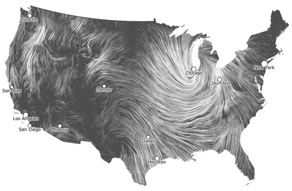
Hint.FM's live wind map is just mesmerizing to watch and was created to act as a portrait of wind current over the U.S.. The project caught most of its attention during Hurricane Sandy and was inspired by an Eyeo2012 talk.
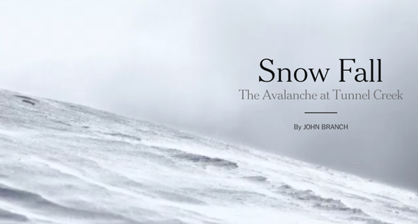
(NEW) Just this week, The New York Times released an incredible multimedia story, Snow Fall. Wow. We're still checking this out, but its obvious it should be included in this annual wrap-up for its beauty as well as its advances in interaction and interface patterns.
Tomorrow, we'll talk about the noticeable growth in the news nerd community as well as some of the awesome new tools.
Also, don't be shy. If we forgot something, please add your thoughts on other stellar work in the comments below or on Twitter. Use #newsinno12 and we’ll add the items from Twitter here.
About the author