In the great tradition of news organizations for at least the last few decades the Knight Lab is taking a look back at the year gone by.
It’s safe to say that for the technology and journalism community, 2012 was a great one. Every event and gathering seemed to have more people, more energy, and more ideas than in years past. All those people, ideas and energy produced some great work.
Each day this week, we’ll look back at 2012 to highlight what we think are the significant achievements, advances, or cool projects of the past year. And not necessarily finished products — there was plenty to celebrate in the community of coder journalists that didn’t result in something that the public could read, watch, or click. Look for those ideas later this week.
First up, we’ll take a quick look at some of the storytelling that made 2012 great. This isn’t a “Best of” list, just some ideas we thought were intriguing.
And of course, we’re hoping these posts are the beginning of a conversation. Link to additional stellar work in the comments below or on Twitter with the hashtag #newsinno12.
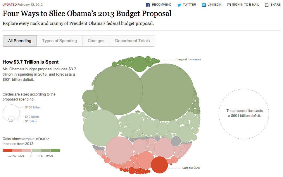
Four Ways to Slice the Budget
The federal budget and deficit are always big stories and years past have produced great work on this story. This year, we we’re blown away by The New York Times’ Four Ways to Slice the Budget. This work takes the gigantic, unwieldy, difficult-to-understand Federal Budget and makes it approachable. It’s hard to think of a set of data that’s as difficult to understand or visualize as the federal budget. This work allows readers to see clearly which parts of the budget are most expensive and have either grown or shrunk the most year to year. It’s one thing to be told Medicare, Medicaid and Social Security are expensive, but it’s another to see just what a big chunk (55 percent) of federal spending those services account for. Really great work on an important story.
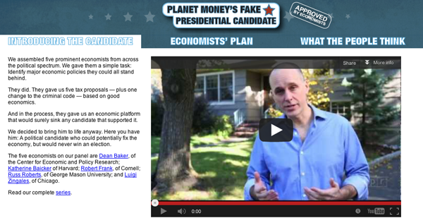
Fake Presidential Candidate
While The New York Times worked out the federal budget for readers, Planet Money’s Fake Presidential Candidate work went beyond merely reporting the tit-for-tat, back-and-forth of different economists and instead found the policies that several major economists agreed would be good for the country. But what made Planet Money’s idea great was to put it in the context of the presidential campaign by creating a fake candidate — commercials and all. They explained each of the policies (getting rid of the mortgage deduction, shifting from income tax to consumption tax, etc.) and then presented poll data that showed what Americans thought about the policies. All in all, some really fun, inventive storytelling.
Alex Blumberg
Caitlin Kenney
Joshua Marston
Miki Meek
Robert Smith
Lam Thuy Vo
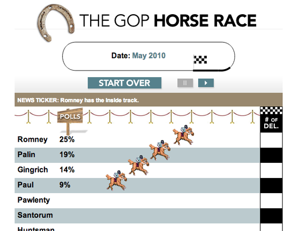
GOP Horse Race
Slate’s GOP Horse Race feature came amid a raft of racing graphics this year, which, to be fair, mostly had to do with the Olympics. Slate’s story showed very clearly the evolution of the Republican primary race. Poll data and numbers contained a story and numbers and the horse race feature was a great way to reveal it.
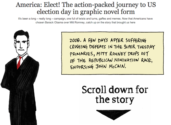
America: Elect! The action-packed journey to US election day Graphic Novel
The Guardian US interative team’s election recap graphic novel (read: comic) is a great example of how the web enables new types of storytelling. The scrolling action of the feature is fun and it's satisfying to watch all the different graphic elements slip in to place as they rise up the screen. Many news organizations would have taken each of the elements recreated by the artist — the surreptitiously recorded Romney video, Obama's first debate performance, etc. — and embedded the original on the page. The problem with that is that most readers have already seen the originals. By presenting a graphic representation the Guardian gave readers a vivid, creative memory of the event without making them sit through the original video or merely read text recapping the event. This is a great piece of work — art, technology, and story all coming together beautifully.

The Internet loves a good gif. And this year journalism got on board. Business Insider deployed gifs expertly as a big spoon full of sugar to the medicine that is the jobs and budget crisis. Buzzfeed told the inspiring story of a Chinese hurdler who refused to quit. And The Atlantic Wire told the story of Gabby Douglas winning Gold. Who cares? Maybe no one, but the rise of gifs shows that journalists can take a simple technology and use it to make stories more intriguing. And that’s good for everyone.
Credit for the above gif goes to: Rortybomb.
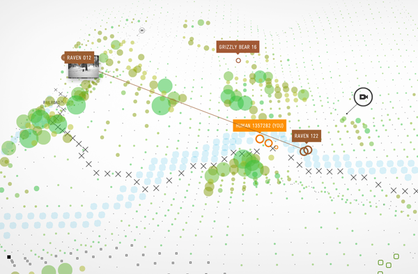
Bear 71
It’s probably best to just watch Bear71. But, insufficiently, Bear71 it’s an interactive web documentary that shows us the life of a grizzly bear who was collared at age three and watched throughout her whole life via cameras in Banff National Park. What makes it great is that it combines years and years worth of data on wildlife movements and combines it with narrative documentary that overlays an interactive interface that truly adds to the story. The three elements work incredibly well together and was undoubtedly difficult to pull off. A great bit of work.
That’s it for today. Check in tomorrow as we look at great design and presentation over the past year.
Again, we’re hoping these posts are the beginning of a conversation. Add other stellar work in the comments below or on Twitter.
Use #newsinno12 and we’ll add the items from Twitter here.
About the author