This story is part of a series on bringing the journalism we produce to as many people as possible, regardless of language, access to technology, or physical capability. Find the series introduction, as well as a list of published stories here.
I am one of the 8% of men of Northern European descent who suffers from red-green colorblindness. Specifically, I have a mild case of protanopia (also called protanomaly), which means that my eyes lack a sufficient number of retinal cones to accurately see red wavelengths. To me some purples appear closer to blue; some oranges and light greens appear closer to yellow; dark greens and brown are sometimes indistinguishable.
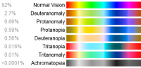
Most of the time this has little impact on my day-to-day life, but as a news consumer and designer I often find myself struggling to read certain visualizations because my eyes just can’t distinguish the color scheme. (If you're not colorblind and are interested in experiencing it, check out Dan Kaminsky’s iPhone app DanKam which uses augmented reality to let you experience the world through different color visions.)
As information architects, data visualizers and web designers, we need to make our work accessible to as many people as possible, which includes people with colorblindness.
Color is critical
Color is frequently used to quickly convey meaning. It's an important choice for any visualization, but making one that's attractive, informative and easily distinguishable by colorblind people trips up many designers.
The NPR Visuals team worked through these challenges this spring in a visualization for a story on how school districts spend money.
“Early on after some doing some exploration of the data we knew we were going to do a district level choropleth map,” said Katie Park, deputy graphics editor at NPR. “We thought that it would be easier to read with a diverging color palette where the center value was the U.S. average. When you get into divergent color palettes you realize that colorblindness might become an issue.”
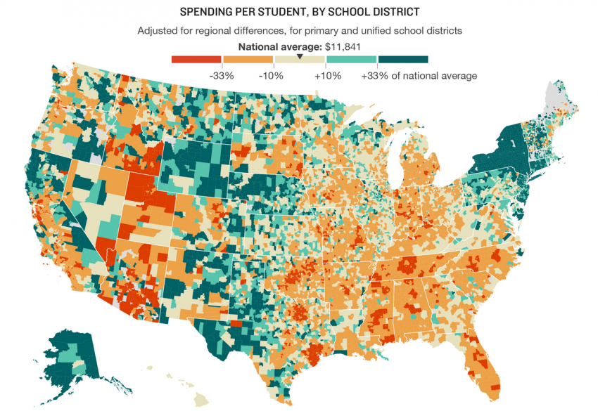
Park said that the default color schemes designers might use — like green for positive values and red for negative values — tend to cause problems for colorblind readers.
Meanwhile, common colorblind friendly palettes like magenta/green or orange/purple are devoid of meaning. Pink, for example, doesn’t convey negativity like red does. Others, like blue/red, are already imbued with too much cultural meaning and would be confusing in a non-political map.
Sometimes you can get away with using a single hue and varying its lightness. But sometimes a project calls for a multi-hue scale or a diverging scale. (If you’re interested in reading more, The New York Times’ Gregor Aisch wrote a blog post about his library chroma.js that goes into more detail on multi-hue scales)
Three tools to help
There are a few simple tools to help ensure that your projects are colorblind-friendly.
- Start by using the color schemes on ColorBrewer, which gives you sequential, diverging, and categorical (sometimes called binary) palettes that are colorblind safe. You can use these and modify them to fit your style guide. “I try to find a good compromise between our colors, the colors that work in ColorBrewer, and the things that look good on the page,” Park said, noting that she'll tinker with the colors in Illustrator until she’s happy with the palette. “Usually my trick is to tweak the shades a little bit so that the greens have a little bit more blue in them,” Park added. “But the problem with that is that if you’re greens get too blue then you start to look like you have a political map or the colors just don’t read as intuitively.”
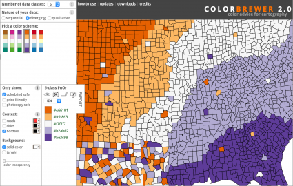
ColorBrewer, generates colorblind-friendly color palettes. NPR's Katie Park starts with the colors here and then tweaks to find colors that look good on the page. - Gregor Aisch’s chroma tool is also useful for optimizing your diverging color palettes. It can help you take two or more colors and generate a full scale of in-between values.
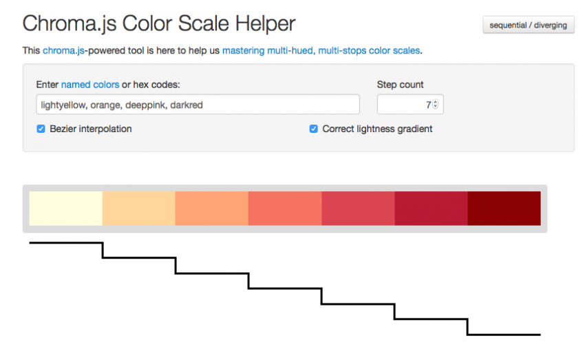
The chroma.js-powered Color Scale Helper is an easy way to generate sequential and diverging color palettes. - Before publishing, you should check your work. Color Oracle and Sim Daltonism both let non-colorblind people simulate colorblindness on their screens.
Sim Daltonism lets you see your visualizations as though you were colorblind. Image from Flickr/Richard Ricciardi
The great thing about picking a palette, is that once you have it, you can use it again and again.
Taking a few minutes before publishing a project to make sure it’s colorblind friendly is an easy way to make your work have a bigger impact.
About the author


