This story is part of a series on bringing the journalism we produce to as many people as possible, regardless of language, access to technology, or physical capability. Find the series introduction, as well as a list of published stories here.
Although internet adoption rates have neared saturation among young adults and people with higher education, a broader, more diverse audience lags behind when it comes to internet connectivity, often relying on slow, mobile-only connections. These groups pose a particular challenge for those of us charged with providing equal access to the journalism we create.
"It's really easy, particularly in graphics journalism to always want to be on the cutting edge, always working on the coolest technology, but we have to remember that that's all privileged in many places,” said Aaron Williams, a graphics reporter at The Washington Post.
"A community that I'm also trying to serve are folks where their primary computing device might be their cell phone,” Williams said, noting that this is less common in cities, but more common in areas “that might be described as working-class or lower-income.”
Though load times are always important, they're even more important when designing for readers whose only access may be a mobile device. To make our content as quick-to-load as possible we have to consider: 1) the websites on which they’re published, 2) the platforms on which they’re distributed, and 3) the graphics and stories that they contain.
Fast websites
Almost everyone knows that ads and background scripts weigh webpages down. What is less known is just how slow they can make a site. When the New York Times studied the mobile home pages of the top 50 news sites it found more than half of all data on those sites came from advertising, with page load times varying significantly for readers who were using an ad blocker and those who weren't. For some sites, readers using an ad blocker saw page load times of about seven seconds compared with 33 seconds for those without. Some websites served the user as much as 15.4 megabytes of data in advertising content alone.
Clearly, if it's a priority to serve readers with mobile-only or limited connections publishers must reevaluate mobile ads and the clutter they create. Publishers have used a variety of techniques to make this happen. In 2015, Slate took on the task of decreasing its page load time by 75 percent, and targeted third-party services and trackers for things like ads, a paywall, and its commenting system.For some sites, readers using an ad blocker saw pages load in about seven seconds compared with 33 seconds for those without. Similarly some websites served users as much as 15.4 megabytes of data in advertising content alone.
Similarly, Vox Media, which has eight different websites, declared “performance bankruptcy” last May. Dan Chilton, Front-End Engineering Director at Vox, described this as “consolidating all of our performance debts and working holistically to get back in the black.” Essentially, this meant acknowledging their low performance numbers, and then working to improve metrics like speed index numbers and seconds to page complete (the time it takes for a page to load completely). In several performance updates over the last few months, Chilton has outlined how Vox has worked to decrease page load time. They've looked specifically at optimizing their font delivery system, ad performance, and server response time and have created internal tools for gathering and sharing performance-relevant metrics. “Until our sites load at the speed of causality, our work must continue,” writes Chilton.
/cdn0.vox-cdn.com/uploads/chorus_asset/file/6139681/MsjsA7E.0.png)
The role of platforms
Though publishers would do well to optimize their sites and content for speed, it's also true that the rise of third party platforms might ease the burden. Google’s Accelerated Mobile Pages (AMP) and Facebook Instant Articles have emerged as alternatives to reading articles on the (sometimes sucky) mobile web, and are specifically designed to decrease load times by optimizing content for mobile. Facebook claims that it can load an article as much as 10 times faster than a publisher can on its own site (where the average load time is eight seconds). Whether audiences are loading pages on the web or through apps, AMP, Instant Articles, and other products are emerging to close the performance gap and improve the overall experience of reading articles on mobile.
Graphics and visual storytelling
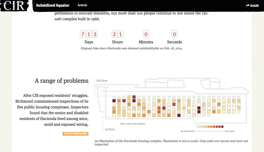
For specific stories, graphics, and news apps, simplicity is key for performance. Recently, this has meant a shift back to static graphic, as Archie Tse, Deputy Graphics Director at The New York Times said at Malofiej 24 in March. “When deciding whether to make something interactive, remember that getting it to work on all platforms is expensive.” Not only is it expensive and time-intensive, but it might also exclude readers with limited internet connections.
“There's been some more humility introduced to the industry and how we build things,” Williams said. “Readers still want to read good journalism, but they don't want it to take 20-30 seconds to load and don't want to have to download over 2 or 3 MB of data just to learn that Drake dropped a new album.”'If our mission as reporters is to tell stories and get the widest reach, I think we definitely need to think about these communities as well; people who may not look like us, either by race or by our socioeconomic backgrounds.'
To make data visualization accessible on mobile devices, this often means swapping out a complex graphic for a simpler one, minimizing gratuitous animations, and disabling or getting rid of interactive components like tooltips and buttons. Williams described a shift in the data journalism and graphics community over the last five or so years: where graphics used to be JavaScript intensive, he now sees a movement back to the web development convention of "progressive enhancement."
“This is old practices being renewed,” Williams said. “Using HTML and CSS as much as you can and only having the JavaScript embellishing. I’m trying with my graphics to put as much on the page as I can.” On mobile, the combination of limited connectivity and limited attention span translates to simple, stripped-down, but effective, information.
Looking towards the future, Williams noted that “we’re almost at a point where very soon the [mobile] browser will have a way to access other features of the device.” Currently, mobile browsers have access to a user’s screen size and location. “Soon we'll be able to know battery life, network speed, and be able to render a page intelligently based on that information, I think....hopefully takes into consideration people who have smaller connections.”

For Williams, looking beyond the immediate graphics and data journalism community is key. “It's still small enough that a lot of people know each other, so I think we can talk about work in really cool ways. But it is at a point where it's big enough now that it can't just be us talking. We need to go outside.”
He notes that performance and technical improvements are not the only ways of producing more accessible journalism. Feedback and inclusion from the general public will help inform journalists’ approach to their work. “If our mission as reporters, as journalists, is to tell stories and get the widest reach, I think we definitely need to think about these communities as well [...] -- people who may not look like us, either by race or by our socioeconomic backgrounds,” he said.
About the author


