At last week’s Society of News Design’s San Francisco Conference, three speakers hosted a panel on the application of unconscious bias in design: Sanny Lin, a product designer at Bloc; Martin Gee, senior art director at Time; and Tory Hargro, a product design manager at Facebook.
Unconscious biases are the unconscious clichéd beliefs we hold about certain social groups. While we may consciously loathe the biases, numerous studies and research show that we act on them in settings ranging from walking down the street to medical and hiring decisions.
At SND Lin pointed out that the subconscious decisions and judgments we make about people extend to situations and products. She explained that these biases form as a result of five influences: past experience, community influence, indirect messaging, direct messaging, and reinforcement.
Designers hold particular sway in two of the ways bias is formed: day-to-day messaging and reinforcement. Think about how many times a the default user icon reflects a white male. YikYak, to cite just one example, uses a white male icon for “me.”
Designers and customers may not see making changes to icons as a priority, and often dismiss them as a “waste of time” or a “marketing gimmick,” Lin said, but representing people beyond the default norm is more than a gimmick or a way to sell products and services.
So what can a designer do? How can designers change what we reinforce, and push people to change what they consider normal?
Modify defaults

One solution is to change the defaults. In August 2015 Slack used a brown hand for the “Add to Slack” button. It’s a small change, but Slack product designer Diogenes Brito explained that Slack users were “appreciative of being represented in a world where American media has the bad habit of portraying white people as the default, and everyone else as deviations from the norm.” In order to actually change our expectations of what is normal, designers need to move away from reinforcing this idea that white is the default norm.
Require action
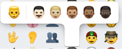
Even when well-intentioned emojis have occasionally generated controversy, but Lin sees value not only in the diversity but in the action needed to change a default emoji. Embedded in that extra step of requiring a user to hold down the default icon to make a change, is a conscious decision that combats a reinforced stereotype. Emojis can still generate controversy and Lin acknowledges this is not a perfect solution, but it is a step in the right direction and has opened up the discussion for how these emojis can continue to be more inclusive in other ways such as gender.
Elevate voices
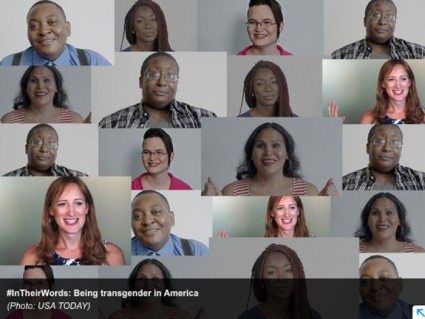
What unites us more than the color of our skin, emphasized Hargro, is the diversity of our experiences. In order to have an authentic conversation it’s a designer’s job to elevate the voices of the people actually being impacted. To be clear, that isn’t elevate one voice to serve as a mouthpiece of an entire group, but rather to seek out multiple voices. #Intheirwords, a series from USA Today, elevates a variety voices, Hargro said. It’s essential that a designer doesn't attempt to speak on behalf of people, but to give them a platform to speak for themselves.
About the author

