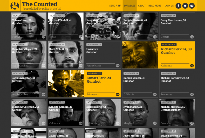
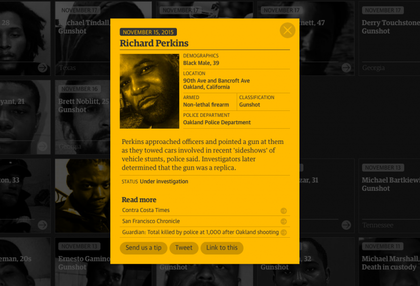
On Nov. 15, Richard Perkins was fatally shot by officers in Oakland, California. His death marked the 1,000th entry in The Guardian’s The Counted’s database that now includes more than 1,063 names.
The project launched June 1, and has quickly won acclaim for its relatively robust law enforcement killings database, which is generated via tips submitted on the Guardian website or on social media. In fact, in October, James Comey, the director of the Federal Bureau of Investigation, called it “ridiculous [and] embarrassing” that the Guardian U.S. and the Washington Post, which created a similar database, do a better job of cataloguing these deaths than the federal government.
“It is unacceptable that the Washington Post and the Guardian newspaper from the UK are becoming the lead source of information about violent encounters between [U.S.] police and civilians,” Comey said, according to The Guardian U.S. “That is not good for anybody.”
Last week, the FBI announced it was planning to restructure the way it tracks deaths caused by police officers.
I had the opportunity to ask the Guardian U.S.’ interactive team members about their work on The Counted and the process of visualizing the data. Kenan Davis, Rich Harris, Nadja Popovich and Kenton Powell responded as a group via email.
Answers have been edited for style and clarity.
Knight Lab: Can you explain the general process the team went through to visualize the data from concept to completion? (Did it differ from past projects, or is there a similar process used for all projects?)
The Guardian: This was a much more collaborative project across the newsroom than anything we’d worked on before. Reporters Jon Swaine, Oliver Laughland and Jamiles Lartey were responsible for much of the data gathering and vetting for The Counted. They set up the methodology for how to gather and confirm cases, though our interactive team helped pull in an initial dataset from Killed By Police and Fatal Encounters that provided a foundation for the project. Our team worked on the main database and the corresponding map of people killed by police, and we did some wider data analysis. The Guardian US audience team planned the various community aspects of the project, including a tip sheet, a Facebook group and a Twitter feed. We consulted with each other often, meeting weekly as a group to discuss progress and share ideas.
There was a lot of back and forth about the database concept and design between various stakeholders in the office, including our team, the reporters and editors. We worked hard to get the tone right for this project – it's a difficult strike a balance between somber and compelling.
In other ways, the workflow was not dissimilar to other projects we’ve worked on before. Our team tends to work in a highly collaborative fashion, brainstorming together and mapping out the general outlines of a project before we each begin to contribute our own pieces.
KL: What languages/tools were used to create the project?
TG: The project is written in JavaScript, specifically using a library that is maintained by team member Rich Harris, Ractive.js. We also used Mapbox for the mapping.
KL: When did the planning for the project begin? Was this something that started a long time before The Counted officially launched? If so, how long before? Also, how long did it take to create the final product, from concept to completion?
TG: Initial planning for the project began around March and we launched the database at the beginning of June. In all, it took about three months to complete, on and off.
KL: Can you explain how the data is visualized and why the team designed it the way it did?
TG: The main page needs to serve several different audiences – people looking for information about a specific case, people who have been following The Counted for some time, people who are visiting for the first time, and so on. For that reason, we felt it was important to have a ‘summary dashboard’ that could quickly paint a picture for newcomers, without obstructing people who just wanted to see what was new, or drill down into individual cases. We also wanted to avoid ‘chart fatigue’ or a sense that we’re reducing the cases to mere statistics – another reason not to overwhelm readers with visualizations.
Away from the main page, we occasionally produce bespoke visualizations for individual articles, such as these charts showing that black people killed by police are more than twice as likely to be unarmed as white people.
KL: Were there any other alternatives that were considered? If so, what were they and why did the team end up choosing what is now the final one?
TG: Initially, we didn’t display images on the tiles because of space constraints. The page was far more sterile without them and lacked humanity. We soon realized that we could put the images behind the text if we made the images grayscale. This humanized the project without sacrificing the efficiency and elegance of the tiles.
About the author