When Broadly, Vice’s female-centric vertical debuted on August 3, 2015, I was struck not just by the kinds of content they were putting out, but also by its clean yet personable design that complemented its unique voice. Unlike the heavy black color scheme and font weights of Vice Media’s other sites, Broadly was bold in its use of color, typography and grids. I was curious about how Vice designed and launched Broadly, a site that is simultaneously so different from any of their other verticals in look, feel and audience, yet retains Vice’s edgy aesthetic.
According to Amy Schriefer, Broadly’s Senior Digital Producer, and Dersu Rhodes, Design Director for the Los Angeles headquarters, the major guiding elements were a strong editorial mission, a clearly defined aesthetic and the collaborative, multiplatform ecosystem that is Vice Media.
Not just Vice for girls
Broadly started with a definition of its mission and sensibility. Tracie Egan Morrissey, Broadly’s Editor-in-Chief, came to Vice with the proposal for a women’s focused channel last year. Although Vice’s audience typically consists of what Schriefer called a coveted demographic for advertisers — 24-year old men — this also meant there was still half of the population that they were not, but could be, reaching. Broadly was “conceived to fill that void, not just the void at Vice but also the void in women’s media in particular,” Schriefer said.
After coming up with the concept and editorial mission statement, Shanon Kelley, Broadly’s publisher, approached Rhodes to start building the initial pitch deck. Around the same time these mission-based and content-based elements were established, Schriefer and a digital designer came onboard to work on the general look and feel of the site, as well as the general UX. “We were pretty adamant we didn’t want it to be the Vice look but just pink,” Schriefer explained. During a brand review of other women’s media sites, Rhodes noted that most sites focused on fashion or celebrity, whereas they believed that “women were actually very interested in real news and real conversation.” Schriefer emphasized, “we did not want it to be Vice for girls.”
Multiplatform collaboration
Broadly was conceptualized in New York while the primary development of Broadly’s look was done in Los Angeles with Rhodes’ team. It then went back to New York where a creative director and art director worked on deeper style guidelines and Schriefer’s web development team handled and built the specific site design details. “It went through a lot of hands,” said Rhodes.
Schriefer’s team worked with the marketing and social departments from the start to make sure everything could translate from platform to platform. For her, coming up with a name and logo also meant thinking about how it would translate to a Twitter avatar. Similarly, the biggest challenge for Rhodes was crafting an overall look that would be cohesive and consistent in both print and digital, as well as across a variety of other mediums like ads and billboards. For him, it helped that his team “started really early in the game establishing what the look of the vertical would be.” This involved working closely with other individuals in these beginning stages. He and Vice’s executive global design director pulled typography from magazines and started to establish a color, and he worked with Broadly’s creative director and art director to build the initial look and imagery.
We didn’t want to be precious. We didn’t want it to feel cute.
Because Broadly was going to be producing video and photography in addition to written content, Rhodes was also in charge of establishing a styleguide in order to maintain a cohesive look across platforms. For example, they looked to break away from traditional photography and go for a cleaner, more authentic look that tied in with the The benefit of this styleguide was that they were, from the beginning, able to give a brief to any freelancer regarding Broadly’s illustration and photography. “We believe in realism,” Schriefer said. “You don’t have to soft focus it.”
For both Rhodes and Schriefer, the key was embracing the various roles of everyone involved. Rhodes appreciated Vice’s slightly “chaotic” atmosphere because it allowed for “a diverse group of people” who brought with them an equally diverse set of skills and levels of understanding related to the project. Schriefer found that having a core team in place, particularly with an editor-in-chief who has worked in web as well as has a background in graphic design, made communication much easier. Additionally, working closely with Broadly’s staff meant that Schriefer’s team was able to show them their work as they iterated on it. “That’s why they’re able to maintain it everyday, because we built it for them, with them,” she said. Rhodes also noted the benefit of Morrissey and Kelley’s strong leadership: “that was the cool part of working with some really powerful creative women who know their shit -- they were able to sort of set the pace and define what they wanted and we were able to translate that.”
Making a bold statement
To differentiate Broadly from other existing sites, they did an extensive survey of the present landscape of women’s media. “We looked for what we didn’t want to look like,” said Schriefer. When looking at competitors, Rhodes found that they “all definitely had a very similar look - it was very cluttered, it was hectic, you felt that your eye didn’t really know where to go.” In contrast, his team approached Broadly’s design in a cleaner way that spoke to a “more powerful woman.”
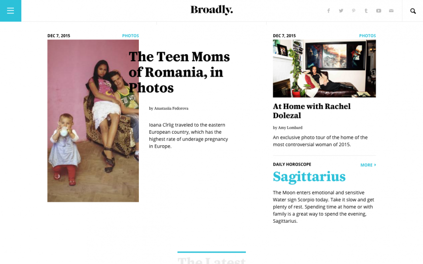
Rhodes said they avoided “feminine elements that were overly saturated” like the color pink. He started playing with a light blueish green turquoise, which Schriefer called “Broadly Blue.” The overall design aimed to be intelligent, classic and bold. Broadly’s main inspiration was 1970s feminist literature and magazines. “We didn’t want to be precious. We didn’t want it to feel cute,” said Schriefer. The brand typography was “just a really deep study in thousands of serif fonts,” said Rhodes. They settled on Caponi, which was a typeface they found complimented the brand and identity -- classic as well as contemporary.
Because Broadly aimed to “elevate the coverage of women’s interests,” the site’s design intended to capture a literary feeling and prioritize readability. The biggest thing Rhodes made sure of was that to ensure they didn’t design or build anything that took away from the content. “The content is king and everything else is just supposed to compliment it.” Rhodes and Schriefer liked the responsiveness and legibility of the mobile design precisely for this reason. “Even if it was on a small screen it still feels literary [...] and important enough to be a magazine,” said Schriefer.
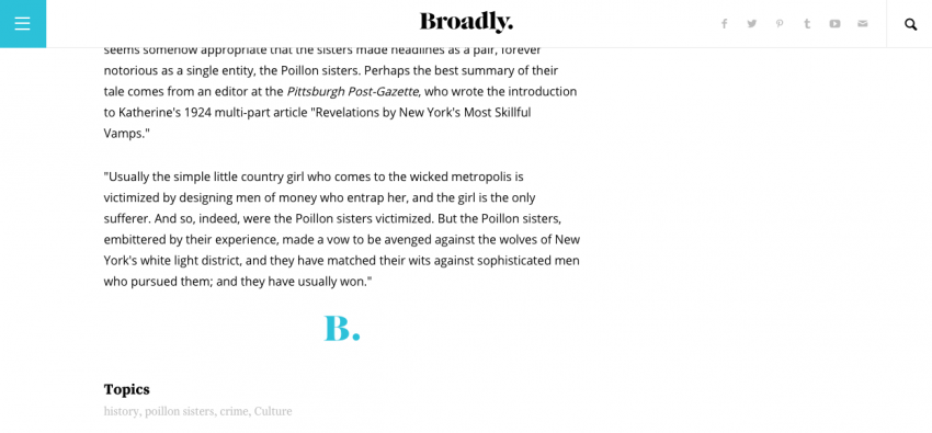
Carving out a unique brand presence extended to the Broadly logo, which is centered at the top in order to feel more like a masthead. Schriefer’s aim was to make Broadly “big and bold and when you scroll it gets out of the way and lets you read.” Each Broadly article ends with a B and a period. Schriefer said this is a sign-off, a signature to establish over and over again, “here we are” and “this is who we are,” which is “that identity that women are always trying to claim.”
Content modeling
With a focus on in-depth, original reporting, Broadly set out to feel less reactionary and be more in line with a magazine experience. According to Schriefer, Broadly was to “be a destination, something that you felt like you wanted to read every day or even just once a week.” Readers shouldn’t be “bludgeoned with having to be there every second.” Instead, you could check in with it on a daily or weekly basis and leave feeling like “you’ve gone a little deeper and you’ve spent more time with something that you really enjoy.”
To accomplish this, Broadly’s content ranges from inspirational DJ Khaled Vines to personal essays such as one titled “Telling My Campus Rape Stories.” One of the most unique content types are their horoscopes (they have a witch on staff). “We never treated [horoscopes] as anything frivolous or funny or throwaway,” Schriefer said. In fact, they served as service-oriented, “snackable” elements that created readers’ daily connection to Broadly. The second format was shortform news content, displayed in a two column layout that might not necessarily have the original photography that Broadly emphasizes. The third format was a longform layout which allowed writers to do original reporting, interviews, and more. Pulling from the “literary vibe,” this layout has the ability to inset columns and pull quotes that go beyond “just a couple of paragraphs and a photo,” said Schriefer. Finally, Broadly has a multimedia layout built for “big beautiful photography or GIFs” and video pages for shortform to longform documentary.
In terms of the technical implementation, since Vice’s audience is 70% mobile for some of their verticals, Schriefer’s team started working on small screens to make sure their design would be responsive and load quickly on mobile devices. Broadly runs on Vice’s custom CMS, the Vice Media Platform (VMP). A custom CMS is built for each Vice vertical. While there was a lot to be shared, there were some things, like the entire horoscope infrastructure, which had to be built from scratch. Schriefer preferred working with a VMP for its flexibility in tailoring it to unique content types and elements.
Making horoscopes work for everyone
The coordination and collaboration on Broadly resulted in the most successful Vice vertical launch in history. But the pure traffic numbers have only been one indicator of success. For Rhodes and Schriefer, a major accomplishment was seeing that more women were reading Vice. Broadly also reached Schriefer’s personal goal of having 60% women readers. The cohesive look and feel of the Broadly brand was strongly rooted in relating every aspect of the design, look and feel, aesthetic and user experience to the editorial mission.
Besides being a women’s interest channel that stood out in the landscape of pink and red-tinted websites, Broadly also created a vertical that reached a broader audience. “When you have a site that speaks to women that's one thing, but when you have a site that speaks to men and women,” said Rhodes. “It’s a huge win.” Schriefer loved seeing her “male coworkers read their horoscope every day.” Broadly lives in the Vice ecosystem, but not as an “opposite or a binary,” she said. “It’s starting a conversation and that’s what we wanted to do.”
About the author
