MozFest 2015: Why data visualization for mobile shouldn't hurt

As data journalists, we tend to focus on visualizing our numbers beautifully for desktops. We pour over D3.js line charts and spend hours getting the tooltips on our maps just right. And right before our deadlines, we’ll throw in some CSS media queries for mobile screens and call it a day. I know I’ve been a culprit more than once.

One of my favorite sessions was Aaron William’s MozFest session “Crafting new visualization techniques for mobile web” where he emphasized a mobile-first, desktop-second focus.

https://twitter.com/aboutaaron/status/663006106701180929

This seems like an obvious concept, especially in a time when desktops have shrunk to the size of your palm and phone screens have grown to the size of your face. But I realized that I always think of mobile design as an obstacle to what I’ve already created, even though many readers use mobile devices as their number one method of absorbing content.

So we started off the session by making a few short lists:

Some types of data visualizations:

  • Maps (cloropleth, heat)
  • Bar graphs
  • Timelines
  • Small multiples
  • Tables
  • Line charts


Advantages of mobile phone:

  • Multiple touch functionality + force touch with iPhone 6S
  • GPS system
  • Portability
  • Normal and front-facing cameras
  • Vibration
  • Screen rotation


Disadvantages of mobile phone:

  • Thumb size affecting touch
  • Small screen size
  • Battery life
  • Bandwidth and weak internet connections
  • No hover functionality
  • No mouse
  • Shorter time and attention span given from audience


The task was to solve a disadvantage or to play up an advantage of data viz on mobile web. My group chose the phone’s GPS system to work with a combination of maps and timelines. A few members of the group had been working on a project called Histropedia, a tool to help users understand the historical timeline about their current location. These are the sketches we came up with.

The results of our brainstorming sessions

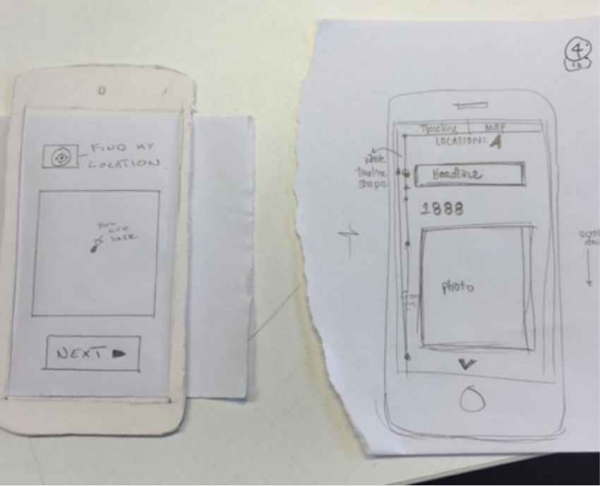
A few other groups tackled timelines as well, presenting the option of showing the timeline as a whole but maybe in truncated sections, a vertical orientation or even a “snakes and ladders” curving situation. We stuck to displaying one timeline card at a time. Each card would theoretically be accompanied by a small line graph of the whole timeline to symbolize the differences in length of time between events or clusters of many events around a short period of time.

Aside from the fun paper phones and great brainstorming, the session helped restructure my perception of data viz and made me think about how my previous projects might have been different with a mobile-first view. Without some qualities exclusive to desktops, we have the opportunity to simplify and detangle our information graphics to focus both our readers and also our storytelling. And I think by thinking mobile first, we can even explore future options of data viz that are ideally suited to a mobile interface and more sensitive to a user’s location, capitalize on the multiple touch function or include vibration qualities that may cater to visually impaired audiences.

About the author

Ashley Wu

Undergraduate Fellow

Designing, developing and studying journalism at Northwestern. Also constantly scouting the campus for free food.

Latest Posts

  • A Big Change That Will Probably Affect Your Storymaps

    A big change is coming to StoryMapJS, and it will affect many, if not most existing storymaps. When making a storymap, one way to set a style and tone for your project is to set the "map type," also known as the "basemap." When we launched StoryMapJS, it included options for a few basemaps created by Stamen Design. These included the "watercolor" style, as well as the default style for new storymaps, "Toner Lite." Stamen...

    Continue Reading

  • Introducing AmyJo Brown, Knight Lab Professional Fellow

    AmyJo Brown, a veteran journalist passionate about supporting and reshaping local political journalism and who it engages, has joined the Knight Lab as a 2022-2023 professional fellow. Her focus is on building The Public Ledger, a data tool structured from local campaign finance data that is designed to track connections and make local political relationships – and their influence – more visible. “Campaign finance data has more stories to tell – if we follow the...

    Continue Reading

  • Interactive Entertainment: How UX Design Shapes Streaming Platforms

    As streaming develops into the latest age of entertainment, how are interfaces and layouts being designed to prioritize user experience and accessibility? The Covid-19 pandemic accelerated streaming services becoming the dominant form of entertainment. There are a handful of new platforms, each with thousands of hours of content, but not much change or differentiation in the user journeys. For the most part, everywhere from Netflix to illegal streaming platforms use similar video streaming UX standards, and...

    Continue Reading

  • Innovation with collaborationExperimenting with AI and investigative journalism in the Americas.

    Lee este artículo en español. How might we use AI technologies to innovate newsgathering and investigative reporting techniques? This was the question we posed to a group of seven newsrooms in Latin America and the US as part of the Americas Cohort during the 2021 JournalismAI Collab Challenges. The Collab is an initiative that brings together media organizations to experiment with AI technologies and journalism. This year,  JournalismAI, a project of Polis, the journalism think-tank at...

    Continue Reading

  • Innovación con colaboraciónCuando el periodismo de investigación experimenta con inteligencia artificial.

    Read this article in English. ¿Cómo podemos usar la inteligencia artificial para innovar las técnicas de reporteo y de periodismo de investigación? Esta es la pregunta que convocó a un grupo de siete organizaciones periodísticas en América Latina y Estados Unidos, el grupo de las Américas del 2021 JournalismAI Collab Challenges. Esta iniciativa de colaboración reúne a medios para experimentar con inteligencia artificial y periodismo. Este año, JournalismAI, un proyecto de Polis, la think-tank de periodismo...

    Continue Reading

  • AI, Automation, and Newsrooms: Finding Fitting Tools for Your Organization

    If you’d like to use technology to make your newsroom more efficient, you’ve come to the right place. Tools exist that can help you find news, manage your work in progress, and distribute your content more effectively than ever before, and we’re here to help you find the ones that are right for you. As part of the Knight Foundation’s AI for Local News program, we worked with the Associated Press to interview dozens of......

    Continue Reading

Storytelling Tools

We build easy-to-use tools that can help you tell better stories.

View More