A year ago, I was struggling to choose between offers to study journalism or computational analysis and public policy. I ultimately chose computational analysis and public policy as I was excited by the prospect of learning about the frontiers of data and policy. I quickly developed a fascination with civic hacking and the open government movement.
Aspiring to use my data science skills for social good and to return eventually to journalism, I applied for a fellowship at Knight Lab and arrived this summer with the hope of developing a project that would help raise public awareness of open data and allow me to experiment with innovative ways of delivering information to readers. Working with my partner, Patricia Gomes and Knight Lab staff, we developed Your CPS, an app that helps readers understand the Chicago Public Schools budget.
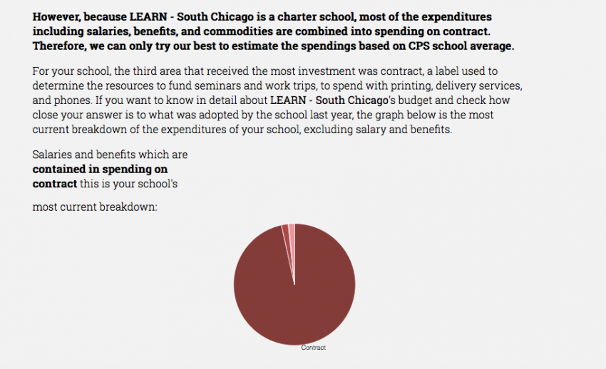
The application builds a dynamic article that delivers custom graphics and text based on the reader’s interest and social demographics. Your CPS explains to readers the origin and impacts of the budget crisis by providing a general depiction of the problem and a detailed account of how the schools readers are most interested in have spent money in years past and how the crisis will likely affect it going forward.
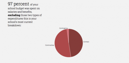
When a reader enters the site, he or she will be prompted to choose a school. A new article is then generated with different texts and graphs based on the school’s budget and profile data. Because of the different financial structures of district and charter schools, we made a distinction by generating specific texts based on the governance type of the school to provide a more truthful story.
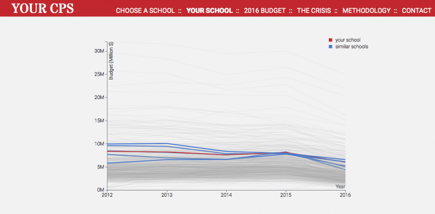
In addition, we find similar schools to the reader’s school based on the social-economic status of the student body to provide more context and a new, arguably a more fair way than looking at results of standardized tests alone, to compare schools.
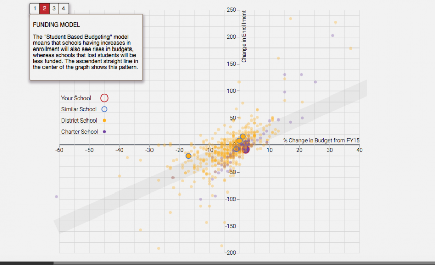
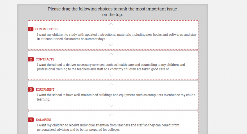
We also designed a ranking game in which the readers can learn about the purpose of each type of school expenditure, rank them according to their perceived priority, and be tested on their knowledge of school budgets. Readers are also guided through a scatter plot that teaches them about the school funding models and what has changed for schools in the 2016 financial year.
Although the project is still experimental and needs refinement, I believe dynamic articles are a powerful way for journalists to inform and engage readers, especially as more government and industry data become available. Below are a few of the things I’ve learned as data scientist that I hope will be useful for anyone who wishes to explore dynamic articles further:
A primer on dynamic articles
Dynamic articles seek deliver information tailored to the reader’s interests. It is distinct from interactive content in that it actually tries to understand the needs of the reader and use insight to present information in a relevant and meaningful manner. The objective, of course, is to try to give the reader the most relevant and important information first and allow them to explore the issue further later. The articles are written coherently and seamlessly for the specific reader.
A few newspapers have attempted to personalize content in various forms. The Wall Street Journal's “Prescribe” shows viewers a video from a first-person perspective as a patient to understand “Obamacare.” Similarly, WSJ's “N-Word” project allows readers to choose three phrases that best represent their views on the “N-Word” before they watch a custom video that discusses that perspective.
A more data-driven example (and the one that inspired our project) is the New York Times article, The Best and Worst Places to Grow Up: How Your Area Compare, which customizes the text and census data readers see based on their location. These projects create engagement by telling the stories from an angel that is as close to the reader’s as possible.
Possible attributes to customize around
Dynamic articles are interesting to me, as someone who often analyzes data, because they force you to look at the information from a personal angle and sometimes in an entirely new way. For most data scientists, looking for patterns out of a chaotic jumble of information is familiar. But to produce a quality dynamic article that satisfies journalistic standards and is interesting and useful to the readers, you need to be able not only to see the entirety of the data but also view it from the perspectives of the individuals who are in the dataset.
Through the research and building that went in to our project, we have found a few likely ways in which an article can be made dynamic.
Geography: Location is a great dimension to customize around since modern browsers allow developers to capture user location without any input from the user. If your story appeals to a certain geographic area —states, counties, congressional districts, people who live near certain rivers or dams, etc. — serving custom content based on this quality is a natural choice.
Time: This approach is very interesting, especially for time-sensitive data. With some searching, you will find publicly available datasets that are composed of real-time data. With access to this type of data, especially sensor data, you can compose a real-time article.
User Preferences: Although less “natural” and elegant than the previous two approaches, asking users about their interests can sometimes be the best way to make an article meaningful to the reader.
For our project, we initially wanted to use location as the way to generate our article. We assumed people from a certain neighborhood would likely be interested in schools nearby. But after several interviews with educational journalists and researchers we learned that many parents don't send their kids to the closest school. We eventually decided it would be best to ask the parents to tell us directly which school they were interested in.
Understand your strengths and weaknesses and plan to learn
Initially I thought Paty and I would divide up the work into writing and data-related tasks working relatively separately, but this proved more difficult than I imagined. I had the expectation that my partner would come to ask me for specific numbers that she needed to support her content. However, it took me some time to realize that since I was the one who was primarily dealing with the data, it would be difficult for her to know exactly what she needed without me explaining to her what I’d done.
For us, going over the datasets and findings together was simply not enough. We found it necessary to determine the newsworthiness of the findings together. I needed to have a stronger voice in deciding which statistics were interesting and how we could interpret them for the user. Even if you work primarily on the data side, you can and probably should participate in shaping ideas for writing.
That said, there are many decisions that are better left to the journalist or designer. In our case, my weakness lies in user experience and design. While we were creating our interactive features, I had no idea what user actions would be too complicated or what types of graphs are generally difficult for readers to understand. Understanding and creating the best interaction with the readership is something that I cannot do well without years of real experience. Designers already have this experience.
What’s more, I knew nothing about design. Most of my past client reports are filled with Python-generated graphs since they suffice as supplements to summaries. Throughout the project, I learned about many small details and principles that I’d never thought of and witnessed Knight Lab’s Heather Billings work wonders with simple design changes. Lastly, many people who work with data don’t necessarily have knowledge of programming languages of the web; so plan ahead to pick up JavaScript, CSS, and HTML.
Computational analysis for dynamic articles
So your partner has started to do desk research, arrange interviews, and draft ideas. Let the data cleaning and analysis begin. Any time you spend on this process will largely determine the quality of your end results. This is a time-consuming process, and, in fact, I found it a major obstacle for scaling up or generalizing the dynamic article format.
There are a few important things that I learned to keep in mind and wish I had done so earlier:
What are we going to do with this dataset anyway?
Creating a dynamic article requires more of the dataset for a simple reason: the customized pieces need to make sense and be coherently integrated with your general story. So if you have a background in data analysis, you may find yourself doing some familiar tasks: understanding the data, addressing the data quality, probabilistic matching, de-duplicating, dealing with outliers, filling in missing data, creating binaries and other variables, producing summary statistics, and so on.
How you deal with outliers and how you fill in what’s missing matters greatly when you frame the individual stories. In many cases, there is no right or wrong answer as long as your methodology is consistent.
Time management
Having a realistic estimation of how long this process will take is very helpful. You need to first consider how you are going to get the information. Should you scrape it, FOIA it? How long will it take? How good is the quality of the data and how much work do you have to do? Chances are that the quality is probably not so great and you’ll need to do work hard to make it usable.
For our project, we happened to choose an arcane dataset that had given headaches to many people we interviewed. To begin with, the data we wanted — the specific expenditures of individual schools — are not readily available on the Chicago Public Schools website. After several attempts to dissect the source code and scrape the database, we decided not to turn the project into “cracking Oracle database 101,” and instead filed a FOIA asking CPS for the data. However, CPS didn’t reply quickly and we resorted to manually obtaining the data.
Joining the Report Card data and the budget data proved to be another difficult task. The schools have IDs and name conventions that vary greatly from one dataset to another. As a result, joining and cleaning the datasets consumed most of our time at the beginning of the project.
Starting the project from scratch, I have learned many things along the way. In the end, creating a truly successful “dynamic article” demands a good dataset and a variety of unique skill sets. Journalistic style and user experience are just as important — if not more — than the form and analysis that technology can offer. It also takes many experiments, testing, and many mistakes to be successful. I hope our project can serve as a proof of concept and the idea will be further developed.
About the author