Some of the coolest investigations that have been published over the last year have made use of remotely sensed data from satellites in space. Space is cool. And journalism is cool. So surely the combination of the two must be interesting. And while it didn’t involve firing rockets with journalists on them into orbit, a session at #NICAR15 titled “Space Journalism” introduced some really cool ideas about using satellite data to find and tell stories.
Brian Jacobs and Al Shaw spoke about their Losing Ground project, which analyzed land loss along the Louisiana coast using satellite imagery. They explained that picking which satellites and which images to use for a story isn’t just an aesthetic decision but an editorial decision that can implicate how you tell your story.
Unlike a typical photograph, there are three aspects to the resolution of a satellite image. Spatial resolution is a measurement of how many square meters are represented in a pixel, which affects how much detail you can get in a picture. The second aspect is temporal resolution, which has to do with how often a certain satellite images a certain patch of land. The third is spectral resolution has to do with the wavelengths of light—for example, infrared or visible light—the sensors on the satellite can identify. For example, Band 5 on Landsat 8 images waves between 0.85 - 0.88 micrometers, which is in the near infrared spectrum.
Brian introduced free tools like Earth Explorer—there’s also a command line tool `landsat-util—to find the images you are looking for. But sometimes that data isn’t good enough, and that’s when things get more complicated. They also talked about their semi-successful efforts to use balloons to capture recent data. Here’s how they explain it in a blog post:
Getting high temporal, spatial and spectral resolution isn’t easy to do if you don’t have deep pockets. A single 10-square-mile multispectral georeferenced image from Digital Globe taken recently was expensive. We purchased two of these, including one for Bay Denesse, another area we wanted to feature in “Louisiana’s Moon Shot.”
But it seems that unless you are doing super high resolution images, Landsat is the best bet for getting good imagery.
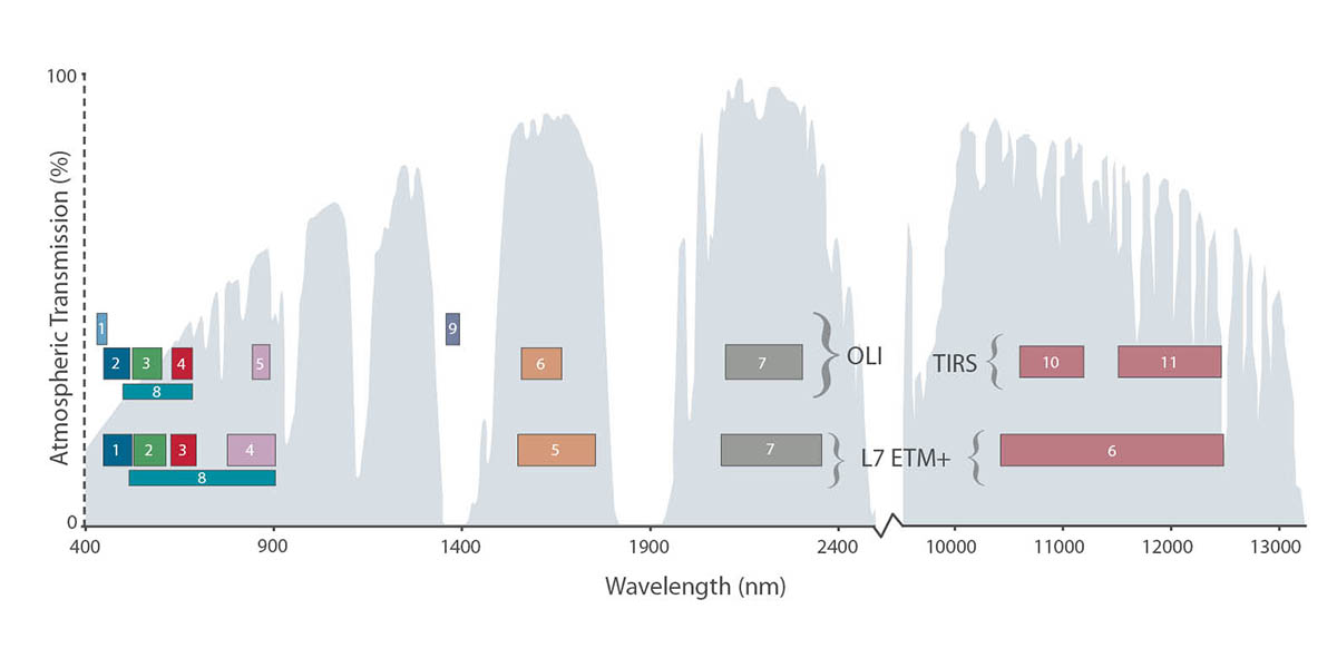
Landsat is the longest running program for taking satellite imagery of Earth (the most recent spacecraft in the program, Landsat 8, was launched in 2013). It takes images in eleven different bands of light. Combining different layers in different combinations creates different images and highlights different aspects of the data. For example, a 4–3–2 combination creates a natural color image (4 being red, 3 being green, and 2 being blue). But as Al Shaw explained, for Losing Ground, that didn’t create enough contrast between muddy water and the land, making it difficult to see the changing coast. So they tried a 7–5–3 layer scheme, which combined shortwave infrared, near infrared, and visible green light; this was good for contrasting the land with the water, but also made the land look an unnatural bright green. Al explained how they used a 4–3–2 layer scheme with a 5 mask on top to recolor the image to match our expectations of how the Earth should look while also highlighting the ocean with the infrared band.. Check out this document to see how this iteration so that they could highlight the data they wanted to. They also discussed this in the presentation, which can be found here as well
Also of interest to those looking into telling stories using satellite data was the live release of schooner-tk during the Lightning Talks. schooner-tk is a tool ProPublica made for manipulating satellite imagery right from the command line: it can stitch images together, create cloudless composites, and even balance the color profile of different datasets. With one line of code using schooner-contrast you can boost the contrast of your images, like this:
About the author