We know data tells us a lot. We write programs to automate data scraping. We spend hours creating data visualizations that help readers see what they need to see. We use data to make claims and generate stories that are reliable and have impact.
Data is important and we seem to be surrounded by it. But that's not quite true. Sometimes, there is no data?
A session at NICAR that really resonated with me was Data from Scratch: When data doesn’t exist, led by Griff Palmer, Ricardo Brom and Lisa Pickoff-White. Pickoff-White shared her experience building PriceCheck, a crowdsourced project that KQED launched last year to answer the question “How much does health care cost?”
The team wanted to compare and contrast the costs of certain procedures or services with and without insurance. The biggest problem was that contracts between patients and their insurance providers were confidential, so no one could get to the information. Except the patient, that is.
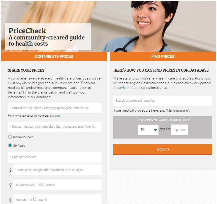
So they crowdsourced for data. KQED was able to get hundreds of users to enter their personal information about insurance benefits (see above) onto the site and then create a database to search for procedures and their respective costs. For example, a particular chest x-ray within 50 miles of my own hometown in the Bay Area costs $107, but one patient paid $36 because her insurance was able to cover the rest.
Strategies
For this project, Pickoff-White mentioned specific strategies they used to make sure they got enough accurate and useful data to “make apples-to-apples comparisons.” Here are seven strategies and tactics she used to get clean data that you can apply to your own projects:
- Get the ball rolling. This is pretty simple. The team used social media and their on-air broadcast presence to take advantage of the trust that people already had in KQED.
- Report during the process. Here is a list of stories the team wrote when they found particularly large disparities in costs with and without insurance. This kept their information relevant and allowed them to push updates to users as they continued to ask for data.
- Ask for one thing at a time. For instance, they would push a request for information on chest x-ray costs and then later another on mammograms. By splitting up the procedures they were asking for, they could target specific people in a wide range of patients and get all the information on one thing at a time.
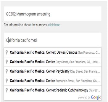
- Do the hard work for the users. The team found that users were making mistakes when filling out the survey on their health benefits, so they implemented autocompleting for procedures they looked for and used Google places to standardize the input of the medical care providers.
- Explain benefits to users. A lot of times, they found that patients didn’t know how to properly read their benefits. This was an opportunity for them to help their target audience learn and contribute their information at the same time.
- Use common sense. The data reporters had a general understanding about health benefits and costs, so they were able to pick out careless mistakes. For example, Pickoff-White noticed that $3592.50 was unusually steep for a certain procedure. She contacted the user, who corrected the mistake to $359.25. This led to the next strategy in which they would...
- Ask for contact information. They included a space for the user to enter in an email address, to correct errors exactly like the one above.
“Some data is better than no data”
Pickoff-White admits it’s hard to determine how much data is enough data to mean something. But because of the specificity of each patient’s experience, the database displays all cases separately which reflects the transparency they aim for. It’s main function is so that someone can search a database and see information on and cost disparities for someone else in a similar situation. Their goal is to get as much data as possible but not necessarily to generalize every patient’s experience into one whopping conclusion.
Here is the powerpoint from the rest of the Data from Scratch session at NICAR.
About the author