For an entire quarter, I had the privilege (a curse to some) of focusing all my time on a single project. Romaine, a social platform/tool for selecting courses, had a simple goal: how do we harness the community nature of the question, “what class are you taking next quarter?”
My initial solution was laughably naive and simple. ‘Just link each course to Facebook!’ I thought to myself. We’d be done in no time. Ha, ha.
When it came down to actually building the project, my teammates Nicole, Mallory, Ashley and I found ourselves discussing the merits of increasing the space between an arrow and an unrelated feature; whether a user needed to see a ‘go’ button even if people are more likely to use the enter key instead; if more information was better than a minimalist look; among countless other details.
My first mistake was assuming that design meant making things look snazzy with some well-structured CSS. Figuring out how to translate a user’s tendencies and usage desires to components of functionality was a rabbit hole of roundabout conversations and only occasional successes that I hadn’t been ready for.
Fortunately, by the 11th hour, we had vetted responses to a survey we sent out to get a better feel for the purpose of Romaine and narrowed its use cases down to three:
At any one point during her college career, average Jane faces one of three situations while registering for classes.
- She knows exactly which classes to take next, because they’re core requirements for her degree.
- She knows what kind of classes to take next, because they’re non-core requirements for her degree.
- She has no idea what classes to be taking, because she either doesn’t care or can afford that flexibility.
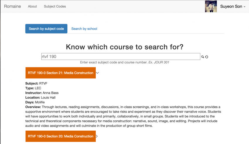
In any of the scenarios, there stands one thing between Jane and that “register” button: retrieving the specific courses to register for. And to retrieve the courses, one must search for them. As it stands, CAESAR, the official course registration system at Northwestern, has a comprehensive but overly specific search system that requires users to know in advance at least which subject they want to look in. So we decided to design a better search process. For the following week and a half, The Search plagued our design-newbie minds.
We knew The Search had to address our primary goal of providing, first and foremost, a platform on which users can leverage the fact that they are considering courses that their friends are potentially taking as well. To figure out at which point and how much friends play a role in the course selection process, we blasted our existing social media platforms with the survey and got as many responses as we could without having to offer our firstborn child or lifetime supply of Chipotle burritos.
While the number of results we received was meager at best (24) and two schools were not represented, most responders said their course selection process was to:
- Figure out requirements left to fulfill.
- Figure out which classes might meet those requirements.
- Vet their potential choices with friends.
At this point, we deemed it important to distinguish between two types of users -- Jane of Scenario 1, and Jane of Scenario 2 or 3. The former gets a kick out of knowing who’s in the class she knows she’s taking, or wants to take a specific section with her friends. The latter is open to influence, and wants to have a browsing capability that CAESAR’s current search engine does not allow for due to its specificity.
To properly address the latter, we spent hours discussing drop-down menus, fuzzy searching, filters and the like. We decided to implement a simple but exact search bar for our Jane who really just wants to get to the course she’ll be taking to see if her friends are in it, too. The other, indecisive Jane received a little more attention.
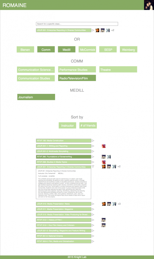
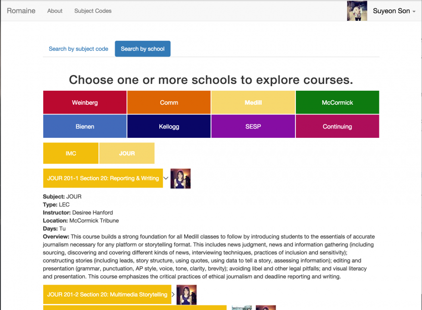
She might know she needs to fulfill a history requirement but this could fall under Gender Studies, History, Russian or any other number of subjects. She might also want to see courses that only fall under specific schools. Maybe she wants to see all 4,000+ stinking courses at once, because hey, options!
So maybe we should have every subject available as a toggle feature, and each subject will bring up information about all the courses that fall under that subject?
The thought was that it’ll be like how Stumbleupon asks its users to check off all their different interests on sign up. But Stumbleupon doesn’t have more than 200 options, and we sure didn’t want the user to have to go through multiple pages of checking off the subjects they’re interested in.
In order to address both the vague nature of course selection and readability of the interface, we decided to keep the toggle feature but implement a two-search system instead, where the user would toggle first by the schools they’re interested in then the subjects offered under those schools.
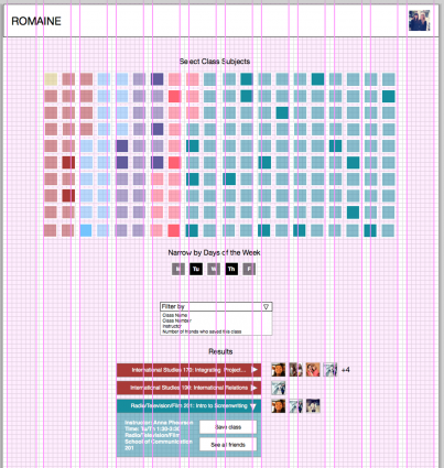
Mostly content with the implementation of The Search, we turned our attention to how to organize the search results next, which was much easier to figure out given how users normally expect their search results to appear.
By default, the results would be grouped by subject then ordered by course number. And since the social aspect is crucial, the friends who’ve selected the same courses the user would be looking at would immediately show up. There would then be the option to view more details for each course.
In the end, we ended up designing a product that would fit our main goal while addressing some of our peers’ complaints about the usability of CAESAR. We did however learn that there was more demand for an application that would allow the users to see what their friends have taken in the past, not just what they will be taking, so they could seek advice.
My team and I did not address all the design challenges. Nor did we find the best possible solutions to the ones we did attempt to tackle. But between paper prototyping with index cards and arguing over the placement of an arrow, we learned that product design is an art form that tests developers’ proactive thought, judgment, and, of course, patience.
About the author

Tagged


