When the Olympics roll around every two years, virtually every news site covers it in one way or another. For interactive teams in particular, the Olympic spectacle provides a wealth of opportunity to craft stories that are beautiful, functional and informational.
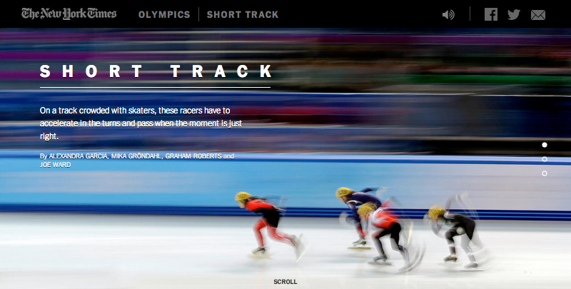
For Sochi many newsrooms put together great packages (some personal favorites include The Guardian’s Sochi Venue Guide and The Washington Post’s Mountains of the Olympics graphic), but I was particularly taken with the scale of the work The New York Times put out — from the heartbreaking “Fourth Place” series to the first-person videos and narrations and detailed composite images.
But all that work begs the question, just how did the Times’ produce so many immersive graphics during the two weeks of the games? The answer isn’t that surprising — it’s a lot of planning and strategic project management.
The planning
Wilson Andrews, a graphics editor at the Times who started last October, said the department began work on the early stages more than six months before the February games began.
“They’d been working for at least a couple months, shooting some of the video for the big video interactives and planning out what events they wanted to cover,” Wilson said.
To create the immersive video experiences, members of the team traveled to the athletes’ training grounds last fall to film, shoot and report. By the time the Games began, these explanatory pieces had already been completed, and the team could focus their attention on news that broke during the games and results.
Andrews, who worked primarily on the composite images, said the goal was to explain the often obtuse, hard-to-understand sports in a way that was both visually pleasing and comprehensible. When brainstorming the best way to present the composite images, he says the team went through several iterations before settling on wide-frame, highly-detailed still images.
"We quickly found out that those composites were the most compelling thing, the most unique,” he said. “We had played around with animating them, but stuck with the whole 'easy-to-use composite' that lets you see what the athletes were doing in such rapid movements … We hadn’t seen anyone else do that and it was a nice way to get into the techniques of those sports.”
The process
The key to producing composites of live events was to develop a system in advance to create and post the images as soon quickly as possible.
The group was divided into five three-person teams of visual journalists. Each team was assigned to an event to cover and began with an intense research and pre-reporting process in the weeks before the games. Andrews, whose team focused on figure skating, said that each journalist aimed to be as educated with their designated sport as possible before the event. They contacted sources (usually experts or ex-Olympians) with whom they would speak right before and immediately after the event so that each composite would be accompanied by thorough reporting and analysis right away.
During the events themselves, members of the team in Sochi would shoot the event and run the images through a Photoshop script they'd written prior to the games, said Larry Buchanan, a Times graphics editor. The script detected the differences between images and created a composite that was “80 percent” there, Buchanan said.
They also built a variety of modules beforehand to create composites, diptychs, or finisher’s graphics depending on the sport. One of the reasons the team was able to get the graphics up so quickly is because their system allowed them to work as a singular unit.
“We function as a standalone entity that produces our own stuff,” Buchanan said. “To that end, we can explain the nitty-gritty details of what’s going on in these sports better than sometimes [written] stories can.”
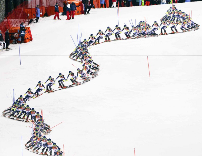
The goal of all the breaking coverage was to provide a unique insight to the readers that they couldn’t find elsewhere — and to push the envelope in storytelling for the web, Buchanan said. He specifically pointed to the graphic of Mikaela Shiffrin’s gold-medal slalom run, which combined a quilt image, a composite and finisher’s graphic all in one, as a particularly good example:
“By the time [Shiffrin] won the slalom, some of us had composite fatigue,” he said. “That was one of the last events we covered live, and we hadn’t seen a composite of that magnitude. That one got everything…It feels so native to the web medium. You’re scrolling down and it reveals how she moves, like you’re going down the mountain with her.”
To create a new experience, sometimes it’s all about putting things into perspective. Buchanan said that his favorite graphic from the entirety of the games was, “Is that a Luge in Times Square?” which illustrated what the Olympic venues would look like if they were plopped in the middle of Manhattan.
“You can’t get a scale of how big these buildings are until you juxtapose them,” he said. “So how can we create that impossible scenario for you? By using these alternative storytelling techniques we’re pushing forward what it takes to create a little story."
The months of planning and meticulous execution allowed the team to create dozens of varied and expansive graphics for the two-week Sochi games, giving users a unique—and most importantly—informative look into the Winter Olympics.
About the author