Displaying of aggregate info: Dynamic storytelling with Google Fusion Tables

Slides from "NewsCamp::The next generation of data viz"

Alberto Cairo gave the first talk I saw at NICAR. The room was packed. He is the author of The Functional Art, maintains a blog the same name, and has become a highly respected expert in data visualization.

Cairo’s talk was titled "NewsCamp::The next generation of data viz," and he made the slides available.

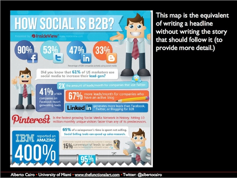
Cairo said something that really stood out for me. “We should not focus on the technical side when we talk about the future of visualization.”

He elaborated that while it is important to learn how to code, no one should focus on the technology over the end product because the technology will change.

From there he listed some predictions. My favorite was number 3, “we will embrace the idea that designers can encode their data more than once.”

That follows the journalistic ideal of always asking questions. Each method of displaying the data essentially answers a different question.

Cairo has taught three Massive Open Online Courses (MOOCs) about data visualization; I was part of the second offering. It was very instructive and hopefully it will be available again soon.

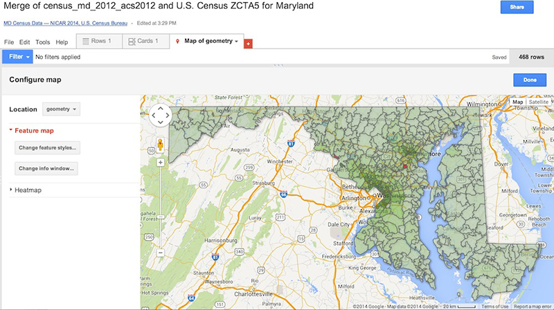
Cairo gave some great pointers to think about when creating data visualizations, but nothing compares to actually creating some. Luckily, Google has created a product called Fusion Tables that make aggregating, combining and displaying data very simple.

It is even possible to incorporate those displays on other pages, such as a blog, but keep in mind what Cairo said about not falling in love with a specific technology.

Even if Google products are not used for the final result, they are great for prototyping.

Daniel Lathrop gave a talk, “Fusion Tables for beginners” and posted his slides on GitHub.

The talk is easy to follow; the only catch being the original census file is no longer available. I created a Fusion Table with the data and shared it.

https://www.google.com/fusiontables/data?docid=1I--hLB-JU5f8B1doRBRI0XpJ8KKh4vEF4MxwQ8s#rows:id=1


The real magic happened when merging. One change from the slides is you need to select “File => Merge” instead of “File => File table to merge with.”

From the merge screen, paste this URL into the box labeled ‘Or paste a web address here:’

https://www.google.com/fusiontables/DataSource?docid=11qjvmE5eTqyjSIeMHgmbQhiFpiS9iycdTUlg4Zg#rows:id=1


Just like the slides suggest, you’re merging the original zipcode column with ZCTA5CE10, which is basically a fancy way of saying zip code.

From there, it is an easy step to see the data on a Google Map.

table

A similar process was done by Tim Henderson who looked at the rate of Section 8 housing by census tract in the suburbs north of New York City.

After two days my head is reeling with new information and ideas about how to use the tools I am discovering. Once the tools are seen in action they really become a lot easier to think about and I can’t wait to start applying them.

Every year New York Times' Chrys Wu curates 'Slides, Links & Tutorials' from the annual CAR conference: 2014, 20132012 and 2011. They are a fantastic resource for all journalists and investigators of all skill levels.

Latest Posts

  • A Big Change That Will Probably Affect Your Storymaps

    A big change is coming to StoryMapJS, and it will affect many, if not most existing storymaps. When making a storymap, one way to set a style and tone for your project is to set the "map type," also known as the "basemap." When we launched StoryMapJS, it included options for a few basemaps created by Stamen Design. These included the "watercolor" style, as well as the default style for new storymaps, "Toner Lite." Stamen...

    Continue Reading

  • Introducing AmyJo Brown, Knight Lab Professional Fellow

    AmyJo Brown, a veteran journalist passionate about supporting and reshaping local political journalism and who it engages, has joined the Knight Lab as a 2022-2023 professional fellow. Her focus is on building The Public Ledger, a data tool structured from local campaign finance data that is designed to track connections and make local political relationships – and their influence – more visible. “Campaign finance data has more stories to tell – if we follow the...

    Continue Reading

  • Interactive Entertainment: How UX Design Shapes Streaming Platforms

    As streaming develops into the latest age of entertainment, how are interfaces and layouts being designed to prioritize user experience and accessibility? The Covid-19 pandemic accelerated streaming services becoming the dominant form of entertainment. There are a handful of new platforms, each with thousands of hours of content, but not much change or differentiation in the user journeys. For the most part, everywhere from Netflix to illegal streaming platforms use similar video streaming UX standards, and...

    Continue Reading

  • Innovation with collaborationExperimenting with AI and investigative journalism in the Americas.

    Lee este artículo en español. How might we use AI technologies to innovate newsgathering and investigative reporting techniques? This was the question we posed to a group of seven newsrooms in Latin America and the US as part of the Americas Cohort during the 2021 JournalismAI Collab Challenges. The Collab is an initiative that brings together media organizations to experiment with AI technologies and journalism. This year,  JournalismAI, a project of Polis, the journalism think-tank at...

    Continue Reading

  • Innovación con colaboraciónCuando el periodismo de investigación experimenta con inteligencia artificial.

    Read this article in English. ¿Cómo podemos usar la inteligencia artificial para innovar las técnicas de reporteo y de periodismo de investigación? Esta es la pregunta que convocó a un grupo de siete organizaciones periodísticas en América Latina y Estados Unidos, el grupo de las Américas del 2021 JournalismAI Collab Challenges. Esta iniciativa de colaboración reúne a medios para experimentar con inteligencia artificial y periodismo. Este año, JournalismAI, un proyecto de Polis, la think-tank de periodismo...

    Continue Reading

  • AI, Automation, and Newsrooms: Finding Fitting Tools for Your Organization

    If you’d like to use technology to make your newsroom more efficient, you’ve come to the right place. Tools exist that can help you find news, manage your work in progress, and distribute your content more effectively than ever before, and we’re here to help you find the ones that are right for you. As part of the Knight Foundation’s AI for Local News program, we worked with the Associated Press to interview dozens of......

    Continue Reading

Storytelling Tools

We build easy-to-use tools that can help you tell better stories.

View More