For the past year, I’ve been transitioning between my previous background as a print news designer to producing graphics and visualizations for the web.
When I planned my schedule for my first ever NICAR, my goal was to attend every data visualization session and panel I could. Four days and over fifteen sessions later, it’s hard to describe the enormous breadth of information I was exposed to, but I feel incredibly lucky to have experienced it all.
So if you are like me (a print designer emerging into the world of data viz), here are the three of the most significant lessons I took away from NICAR 2014:
Lesson 1: It’s all about the process
One of the most valuable sessions for designers was “It's not just for looks: Presentation as a storytelling tool,” with NYT’s Aron Pilhofer, BBC’s Helene Sears and NPR’s Alyson Hurt, moderated by NYT’s Chrys Wu.
The panelists described the design processes used to create some of my favorite large-scale interactive presentations: the Doctor Who 50th Anniversary, The New York Times’ Oscars, and the Planet Money T-shirt series. The Saturday panel was the only truly design-oriented session of the entire conference, and if the packed crowd was any indication, it was well worth the wait. I could probably write a whole post on this session alone! Seeing the many versions that some of my favorite stories have gone through served as a much-needed reminder that nothing you do is ever perfect the first time.
For example, it was inspiring to see how the New York Times’ Oscar presentation has transformed from this:
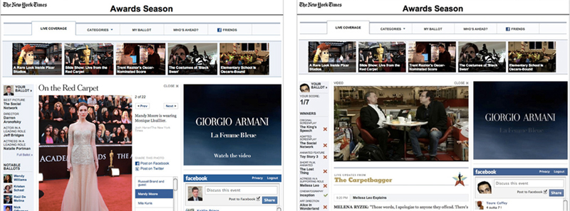
To this:
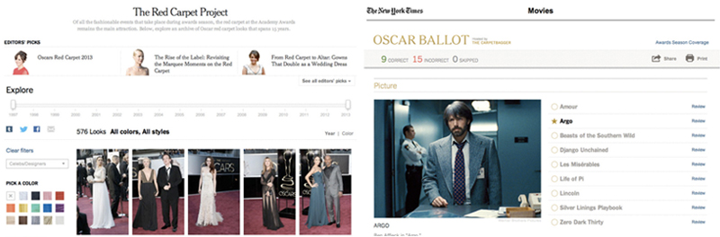
Gone are the tabs and running Facebook feed. Instead, the new Oscars coverage is sleek, intuitive and user friendly, something Pilhofer stressed took several iterations and a lot of collaboration.
Sears, while describing the process behind the Doctor Who 50th Anniversary interactive, boiled BBC’s design process into 5 steps:
- Define the who, what, when and where--who are the stakeholders?
- Brainstorm and bring everyone’s ideas together. There are no bad ideas at this stage.
- Wireframe: user test early and often, and don’t be afraid to revisit steps 1 and 2.
- Prototype, refine and perfect your project on all platforms. Look at it on every device you can get your hands on, and adjust accordingly.
- Deliver a product that works across devices and has been user-tested thoroughly.
As each panelist described the process that went into creating these large-scale interactives, it became clear that user testing is everything--design should be beautiful, but it should above all be functional.
If you want the full presentation (which I would highly recommend to anyone), you can find it here (courtesy of Chrys Wu's 'Slides, Links & Tutorials' 2014).
Lesson 2: Take a step back every now and then.
It’s easy to get lost in the weeds of what at first seems like a great idea, but later turns out to be a wreck--just because something looks clean and well-designed doesn’t mean it’s the best way to present your data.
One of my favorite examples is this map, widely discussed in a couple of the sections I attended, which demonstrates that 50% of the United States’ GDP comes from a seemingly tiny portion of the country:

But when you consider that 40% of the United States’ population lives in the large cities highlighted in orange, it’s really not that useful at all.
Any designers hoping to effectively visualize data could also learn a thing or two from Katie Park’s lightning talk, “What We Can Learn from Terrible Data Viz.” While it’s rare to stumble upon something as unique as this or this in an actual publication, Park emphasized that there are a lessons to be gleaned from even the worst data visualizations:
- Not everything needs to be a chart. Ask yourself if this is really the best way to present what you have.
- Watch your scale. Keep your axes labeled and present your information clearly.
- Double check everything. Pie charts shouldn’t add up to more than 100%, the country of Colombia shouldn’t be spelled with a “U”…you get the point.
Lastly, don’t be afraid to look at things in a different—and sometimes smaller—way. I learned from Lena Groeger’s excellent lightning talk, "A Few of my Favorite Wee Things," that sometimes data viz can be best communicated just by shrinking down the size. She showed several examples of how using small multiples, simple icons and even tiny text can be the most effective way to analyze trends and identify outliers. Not only was the talk an engaging walk through several examples of great data visualization, but it helped me refresh and reset the way I think about presenting information.
Lesson 3: Admire, but with a critical eye
Lastly, designers of any skill level can learn a lot from Alberto Cairo's "Insight and Enlightenment: the Future of Data Visualization."
Cairo stressed that while there is beautiful data visualization all around us, it’s important to always think, “how could I make this better?” He showed several examples of data visualizations, many of which he praised for their innovation and technical skill, but also offered constructive and concise criticism on how to better tell the story. He reminded us that data visualization can be used for entertainment as well as information, highlighting the levity and insightfulness of Visualizing Buffy, which takes a deep dive into the screen time of every character on “Buffy the Vampire Slayer.”
One of Cairo's core tenets: Data visualization should aim to add clarity and bring new light to something the reader doesn’t already know – something to keep in mind for every designer.
Even if you’re like me and are only just beginning your journey as a developer, I would highly recommend attending.
Every year New York Times' Chrys Wu curates 'Slides, Links & Tutorials' from the annual CAR conference: 2014, 2013, 2012 and 2011. They are a fantastic resource for all journalists and investigators of all skill levels.
About the author