A previous version of this story misstated Alberto Cairo's position on the proportion of people who oversimplify infographics. We've removed the number. Read Cairo's take on thinking critically about data visualizations, including his reaction to this piece, here.
Not 15 minutes into the first session at my first NICAR conference, I felt utterly mortified. Here was Alberto Cairo, author of “The Functional Art,” telling me the graphic I retweeted not two weeks ago with the comment, “wow,” sucked.
There goes my journalistic credibility on Twitter.
The graphic in question: a map of the United States demonstrating how half of the country’s gross domestic product (GDP) is concentrated in only a sprinkling of areas.

I didn’t think about it twice. Actually, I don’t think I thought about it at all. The tweet linked to a blog post from The Washington Post’s Chris Cillizza about why we need big cities. The post was based on the graphic, credited to a user on the forum Reddit named Alexandr Trubetskoy.
What could be a wrong in a graphic cited by The Washington Post?
‘Sucked’ is an exaggeration. It was nowhere near the standards of wtfviz.net. Rather, it was “oversimplified” because it failed to illustrate the nuances of the information presented.
“This map is just recreating a population map,” he said. “A number in isolation doesn’t tell anything.”
He then pulled up three additional maps: one of urbanized areas and two representing the migration of college graduates. All were remarkably similar.
I realized I had been allured by the complementary blues and oranges and forgot the graphic was supposed to show me something other than the obvious fact that large cities are usually hubs of the national economy.
And thus, we have Cairo’s five tenets of a great data viz. It must be:
- Truthful
- Functional
- Beautiful
- Insightful
- Enlightening
Trubetskoy’s graphic hit only a few of these.
I embarrassedly thought about my retweet and the numerous other times I must’ve tweeted a data viz project that came together beautifully on my screen. While I opted not to take down these incriminating tweets in true self-deprecating humor, I decided to test out my improved data viz literacy.
I considered a 2012 project from The New York Times called “Girls Lead in Science Exam, but Not in the United States,” something that supported my notions that in the U.S., girls are less likely to be interested in science than boys are.
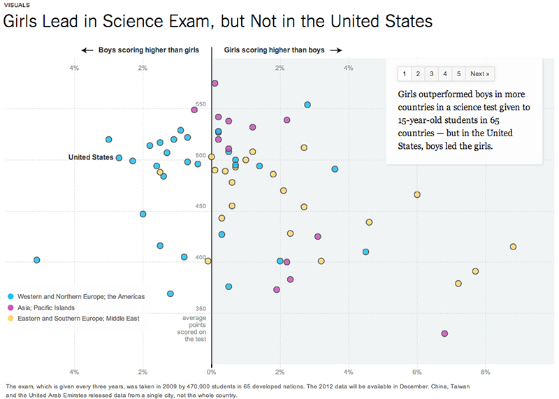
On my second look, I noticed I had neglected the note on the bottom that the data from China, Taiwan and the United Arab Emirates were only representative of a single city in those countries. This means the visualization is comparing mostly national numbers to some city numbers, which would undoubtedly yield a different comparison.
Next question. What exactly was the interactive telling me that we have not been discussing already? I had fallen into the second trap Cairo mentioned: “The problem with preconceived ideas and patterns is that you have to test them somehow.”
We are not told what the perfect score is. Yet, the 14-point difference between boys’ average of 509 and girls’ average of 495 is the basis for both the headline and the graphic. What if the perfect score is 600? What is the statistically significant difference?
Additionally, the graphic is so focused on boys vs. girls that it fails to tell us how the countries perform overall. In Jordan, a country used in the accompanying article as an example in which girls do much better on the exam than boys, the average scores were 398 and 433, respectively. Yes, girls had done better. But neither boys nor girls from Jordan performed as well on average as the boys and girls did in the U.S. Thus, U.S. is being criticized for a ‘gender gap’ in comparison to a country in which its students collectively perform worse on the exams.
And what about the fact that the Organisation for Economic Co-operation and Development, the data source for the graphic, said in its 2009 executive summary that “on average across OECD countries…gender differences in science performance tend to be small,” and that the gender gap of concern is among reading performance?
But The New York Times was factually accurate. It reported the numbers as they are. It was just that multi-dimensional data was only represented by only one of its dimensions.
“Visualization is not something to be seen, it is something to be read,” he said.
Yet, here I was, seeing and not reading.
The interactive is truthful. It is functional. It is beautiful. It is functionally beautiful. I just learned that sometimes, we lose the details in the beauty – just as we are all guilty of retweeting articles only by their headlines without even clicking through to understand the complexity of the matter.
Every year New York Times' Chrys Wu curates 'Slides, Links & Tutorials' from the annual CAR conference: 2014, 2013, 2012 and 2011. They are a fantastic resource for all journalists and investigators of all skill levels.
About the author