
How do you create the most popular piece of content of the year at one of the nation’s most prestigious news outlet?
Well, for starters, study or consider careers in politics, law, and philosophy before eventually deciding that statistics is for you. Then apply to grad school and while you're there dig in to some intriguing data that Harvard researchers had published 10 years prior, apply some stats and smart algorithms, post your work online, then wait for The New York Times to call.
That’s not the whole story of course, but it’s the rough run-up to how Josh Katz ended up an intern at the Times last fall and eventually created (with graphics editor Wilson Andrews) the newspaper’s most popular piece of content in 2013 — “How Y’all, Youse and You Guys Talk.”
“I’d enjoyed the news as a consumer,” Katz said, “but I'd never really pictured myself as being a part of the journalism world.”
“I’d always had an interest in data visualization and finding a way of communicating results graphically,” he said. “What I didn’t realize is that that is essentially a lot of what they do at Times graphics, so it was really a perfect fit.”
Katz’s personal journey to the Times is a fun one, but the story of the technology behind the popular project is just as good.
Last March Katz was a grad student in the Department of Statistics at North Carolina State University and had recently decided he wanted to look more closely at an interesting set of data he’d seen 10 years prior, the Harvard Dialect Survey.
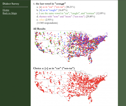
The study was based on the responses of more than 50,000 people to 122 questions on dialect, and had been presented by the researchers (Bert Vaux and Scott Golder) as a series of colored points on a map. While the data was interesting, Katz wanted to show a more elegant “smoothed estimate” of the same data.
Using the k-nearest neighbor algorithm and kernel density estimation (more detail here) he created a series of maps that showed the Harvard data in a series of maps most of us would call heat maps.
In June he posted those maps on the North Carolina State University website and on RStudio.com, a community site for R developers.
By August the graphics desk at the Times had discovered them and invited him to New York for an internship starting in September.
Though satisfied with the work he’d done with the data thus far, Katz had also come up with a plan to verify and update the data and turn it in to a quiz.
To do this he’d need to whittle down the original set of 122 questions in to a manageable number. He’d also need to figure out if dialects in the United States had changed over the last 10 years.
Using the suggestions from the online community he came up with 20 additional questions he thought would help him determine changes in dialect and built a survey of more than 140 questions (the original 122 plus his 20 new ones), and posted it on RStudio.com.
“One of the great things about doing this online was that you get all of this instant feedback and a lot of people have great suggestions,” Katz said.
Of the 140 questions asked, a good portion didn’t tell Katz much.
Pancakes or flapjacks? Everyone says pancakes, Katz said. So that question and about 120 others were thrown out.
To effectively find the most telling though, Katz surveyed 350,000 people not just on dialect questions, but also on age, gender, and where they lived.
The key to the project was Katz’s stats background.
“Getting from the point reference data to having a continuous estimate is really the back bone of the quiz,” Katz said. “There’s this statistical underpinning to the whole project.”
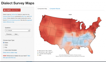
With the most-telling questions in hand, Katz and Andrews set about building the app you see on the Times site. They used D3 and the canvas element to visualize and render the maps. The three cities you get at the end of the quiz are plucked from a database of 150 and are simply the cities where residents are most likely to answer questions like you did.
There are some interesting wrinkles to the project. For one, it’s not designed to predict you where you grew up, Katz said. The quiz simply shows you the region of the country where the dialect most closely matches your own. (Seriously, Bryant Gumble, take note.)
And while that wrinkle may disappoint some users, it also helps make the project intriguing.
“In a way it’s more interesting,” Katz said. “For a lot of people the quiz will show them where their parents grew up.”
Interestingly, the quiz almost didn’t make it onto the Times’ site.
Katz had pitched an enthusiastic group of editors on the project earlier in his internship, but by mid December, with Katz’s time winding down, the quiz still wasn’t up.
On December 21 the quiz was posted and by the end of the year had become the site’s most popular piece of content for 2013.
“I’m pretty blown away by the response to the whole thing,” Katz said. But he can understand the project’s success.
“Dialect is all about people’s sense of identity — ‘this is who I am, this is where I come from,’” he said.
But beyond sentimentality or being able to identify your roots, it’s an entertaining feature.
“At the end of the day it’s fun,” he said.
Internship complete, Katz will start as a staff editor with the Times’ new data journalism project in the next few weeks.
Thanks for reading! While you're here, check out our free tools for journalists and digital storytellers: StoryMapJS (in beta), SoundCiteJS, TimelineJS, and twXplorer.
About the author


