The Knight Lab takes new, innovative ideas wherever we can find them — conferences, quick chats with industry folks, academics, students, etc. But one of the surest places for us to look is Northwestern’s Innovation in Journalism and Technology class. Sure, it’s close to home, but it’s also unique because we get to see prototypes in action — a rarity when discussing ideas and innovation in journalism.
As Larry Birnbaum, a Lab co-founder who co-teaches the class, said today, “The class is one of the key sandboxes, where proof of concept prototypes get carried out to see if they make any sense.”
Yesterday, seven groups of computer science and journalism students presented the projects they’ve been working on for the last ten weeks. (If you missed the live-streaming, you can watch it as an archive or read on.)
Birnbaum and assistant professor of journalism Jeremy Gilbert taught the class and guided the development of each prototype.
Feel free to share your excitement/disappointment/inspiration in the comments below.
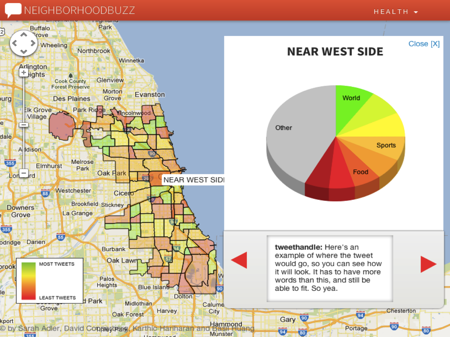
Neighborhood Buzz shows users what people in a particular Chicago neighborhood tweet about most.
Users choose a topic (sports, travel, food, etc.) and the system creates a heat map of the city that shows how often people in different neighborhoods tweet about that topic. Conversely, users can start with the map and click through different neighborhoods to see what each area tweets about most.
At the moment Neighborhood Buzz is tuned to for neighborhoods, but it could be modified to show different geographic boundaries (school districts, zip codes, etc.) or broader, more complex issues (happiness, homophobia, racism, etc.)
Sarah Adler (journalism)
David Cooperberg (computer science)
Karthic Hariharan (computer science)
Basil Huang (computer science)
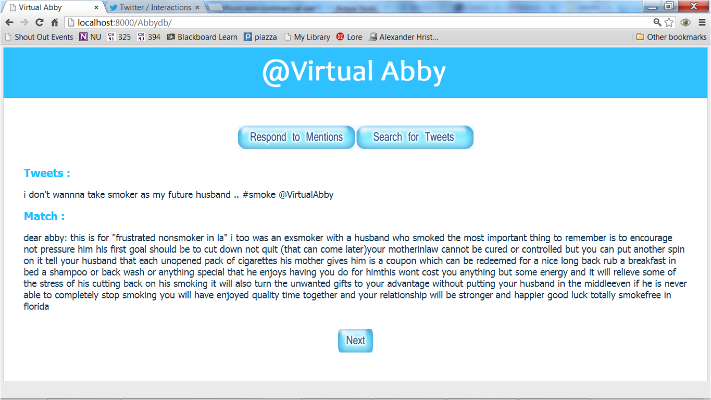
Virtual Abby uses a trove of Dear Abby columns to give advice to people on Twitter. Twitter users who have questions about what to do with a particular real life problem tweet their question to @VirtualAbby. Virtual Abby then replies to the user with links to relevant Dear Abby columns.
Under the hood, the system works by analyzing the content of the question then matching keywords from the tweet with the similar keywords in Dear Abby columns before replying with pertinent links.
Virtual Abby is a fun demonstration that pairs data from Twitter with a popular, and widely syndicated stalwart of American publishing.
Asmaa Aljuhani (computer Science)
John Greene (computer science)
Matthew Zampa (journalism)

Arbitrack is a browser extension that makes political jargon accessible by assessing its origins, offering a definition, and showing other instances of the word or phrase.
Readers of political news stories who have installed Arbitrack will see political jargon highlighted in the text as they read. Partisan jargon is highlighted in either red or blue, depending on the party most likely to use the term (think red for “Obamacare” and blue for “Romnesia.) When the reader hovers over a phrase a pop-up appears that shows a Google trends graph indicating the frequency of use, relevant tweets, an Urban Dictionary definition, and any Wikipedia articles that explain the term.
Though Arbitrack’s database is updated regularly and includes thousands of phrases, users can also submit terms or words for inclusion.
Chip Weinberger (computer Science)
Yee Wei (computer science)
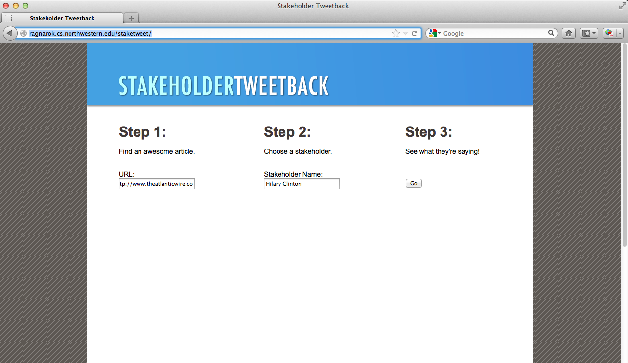
Stakeholder Tweetback gives additional voice and context to the political figures in news stories by allowing readers to quickly see what else public figures have said about a particular subject.
For example someone reading a story on the fiscal cliff might come across a short quote from U.S. Speaker John Boehner. With Stakeholder Tweetback a reader can quickly see what Boehner has said about the fiscal cliff via his twitter handle.
The idea here is to give stakeholders and sources more voice and context than is found in the typical news story. For stakeholders who don’t have a Twitter handle, the system will attempt to find related handles. One good example: the system returns tweets from @USTreasury when Treasure Secretary Tim Geithner’s name is added.
This is another cool tool that uses all the trove of Twitter data to automate a small aspect of storytelling.
Miriam Boon (computer science and social behavior)
Andrew Briggs (computer science and English)
Will Hicks (journalism)
Dynamic Content is a WordPress plugin that provides additional facts and figures for the companies mentioned in financial stories.
The technology allows authors to add a ‘dynamic content’ link as easily as they’d add a hyperlink to a typical WordPress story. After the story is published readers see a ‘dynamic content’ link, which they can hover over for a pop-up that includes a company’s recent news, executive bios, or description.
This is a unique tool that allows users to get additional information very easily without leaving the page.
Dennis Ai (computer science)
April McFadden (journalism)
Audrey Ross (computer science)
WildGuide is a mobile app that uses geo-location to give visitors to the Northwestern campus additional information about buildings and other landmarks they see on campus.
Users, point their phone’s camera at landmarks and Wildguide provides information about what they’re looking at — building names, professors who teach in the building, and the latest news about the school that holds classes there.
Users can also submit events that happened at specific locations.
John Hudson (computer science)
Netta-Lee Lax (journalism)
James Liu (computer science)
About the author