For those of us who aren’t retail executives or addicted to Amazon’s Prime service, Bloomberg’s story on last-minute holiday shopping in November probably didn’t register.
The story basically laid out the number of people the retailer could reach with its new Prime Free Same-Day Delivery service and how it might impact brick and mortar retailers like Target and Wal-Mart during the holiday season.
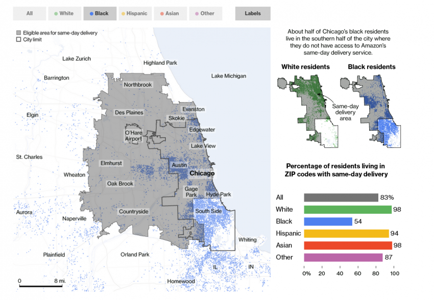
But to the reporters who wrote it, that story provided the kernel that this week resulted in Amazon’s promises to expand service for residents in predominantly black neighborhoods in Chicago, Boston, and New York following outcry from residents, city officials, and members of congress.
The goal, back in November, was pretty simple: add some specific numbers to a story that otherwise would have relied on the generalities of Amazon’s talking points.'Something stuck out,' Ingold said. 'We were able to quickly look at the South Side and say, Amazon doesn’t go there. That’s interesting.'
“Instead of saying ‘Amazon rolls out to X-number of cities,’ we could say ‘it’s rolling out to 75 million people,’” said Bloomberg graphics artist David Ingold who worked on the story with e-commerce reporter Spencer Soper.
But in the process of reporting it, the two began to notice patterns in the data.
“Something stuck out,” Ingold said. “We were able to quickly look at the South Side (of Chicago) and say, (Amazon doesn’t) go there. That’s interesting.” Ingold, who’d been a reporter in Chicago, D.C. and New York, knew neighborhood demographics in the various cities and “quickly saw that there was a potential story.”
They ran the shopping story, then set out to collect and analyze more data.
Collecting data
At first glance, Amazon doesn’t appear to publish the zip codes in which same-day delivery is available. Instead it asks customers to search for their zip code online, and then returns a result that lets the shopper know whether or not the service is available.
In the page’s source code, however, the Bloomberg graphics team could see which zip codes were served by same-day service, which made obtaining the list of serviced areas as simple as copying and pasting the list into a file (though they'd later set up a script to regularly check for updates).
Figuring out the population and racial make-up of each neighborhood was another matter. Ingold looked to data from the American Community Survey 5-year estimate’s table B03002, which provides race information.
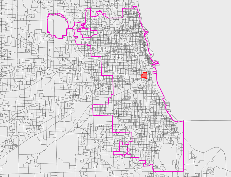
In the highlighted area above, for example, ACS data provides the following:
- Total population: 3,315 (margin of error 569)
- White alone: 1,252 (margin of error 317)
- Black alone: 687 (margin of error 389)
- Hispanic: 583 (margin of error 218)
- Asian alone: 660 (margin of error 192)
Once they had a the ACS data, the Bloomberg graphics team used U.S. Census Bureau shape files and various mapping software to compare demographic data with same-day delivery zip codes.
Here’s Ingold:
“We joined the demographic data to shapefiles provided by the U.S. Census Bureau, and generated a dot density map for each city. These dot density maps were exported to Adobe Illustrator and combined with base maps created in QGIS. The maps were styled in Illustrator and exported for use on the web and in the print edition of Businessweek.
“Throughout the story, we say things like, 96% of white people in Atlanta have access to same-day delivery. These calculations were done in QGIS and R. The geoprocessing tools in QGIS allowed us to calculate the intersect areas between Amazon's delivery boundaries and the block-groups in each city. Data was exported from QGIS into R to calculate the specific totals used in the story and charts.”
Building the web graphic
With data and initial visualizations in hand, Ingold began passing static images around the Bloomberg office, showing editors the core of the story and how it had been visualized. Though they were meant to be an internal tool, those images told the story so effectively that they eventually became the core of the published story.
In addition to telling the story well, they had the extra benefit of not requiring readers to click through an interactive. “If someone didn’t click around,” Ingold said, “we wanted them to walk away with the same narrative as someone who did.”
They also solved the problem of easily presenting cumbersome data sets on mobile, since an image file loads easily and quickly. “Really big explorative graphics on mobile are really, really difficult,” Ingold said. “You can only put so much interactivity on a mobile device.”
The PNGs were also shareable. The map of Boston in which all neighborhoods are serviced except for the majority black neighborhood of Roxbury came to define the project and was shared more than other data visualization, Ingold said.
Adding context and framing the issue
Though the data analysis in many ways formed the core of the story, it ultimately succeeded because of the skills that both the beat reporter and graphics team brought to the table.
“We knew we had an interesting story, but there’s this enormous question of the context around this,” Ingold said. “We knew from the graphics perspective that we needed the reporters who really knew this company to make this story happen.”
While Ingold crunched data and worked on visualizations, Soper set to work finding and interviewing people in affected neighborhoods and data scientists who could bring perspective to the story.
“Once the data was crunched, the key was to attempt to answer why,” Soper said, “and it was a tremendous challenge.”
Amazon is a public company, but notoriously secretive. The two asked Amazon for data on where its Prime customers and fulfillment centers are but were rebuffed. They were left to follow the thread they discovered in November and to turn to experts to help frame the story.'The main takeaway and a-ha moment was that there can be bias in data,' Soper said.
“The main takeaway and a-ha moment was that there can be bias in data,” Soper said. “The data that (companies are) relying on can have biases in it.”
If companies aren’t mindful of biased data they’re likely to build biased products, he said.
Put another way, “you can’t allow big data to make you a big dummy,” as Boston city councilman Tito Jackson told Bloomberg.
Impact
Amazon says it didn’t use race in determining service area boundaries. Instead it relied on "the concentration of Prime members in each area, proximity to warehouses where goods are stored and the company’s ability to find delivery partners to serve an area,” as Soper wrote.
Nevertheless Soper’s and Ingold’s work lead to a number of follow-up stories from other news organizations, outcry from residents and public officials, and, eventually, promises from Amazon to expand service. To date, the company has said it will begin offering same-day delivery to Boston’s Roxbury neighborhood, Chicago’s South Side, and New York’s Bronx Borough.
Bloomberg is keeping watch. The NodeJS script they built pulls the list of zip codes from Amazon’s site and compares it to a previous version multiple times a day. An email notification lets them know when updates occur, Ingold said.
About the author