Data visualizations must tell a good story. But even the best stories might get lost in the translation to a chart, infographic, or map and end up in the dreaded WTF Viz hall of fame. In a session called “Information design for the human brain,” BuzzFeed reporter Peter Aldhous and MediaShift metrics editor and curator Allie Kanik highlighted different ways of encoding data and shared their tips and tricks for deciding the appropriate visualization for a given story that can be easily understood by readers.
Understand the perceptual hierarchy of visual cues
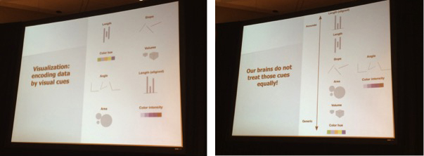
“Data visualization is the encoding of data by visual cues,” Aldhous said. “But our brains do not treat those cues equally.” He outlined a spectrum of visual cues in terms of accuracy, with aligned length as the most accurate (think of a bar chart) and color hue as the most generic. In information design, different tasks will call for different moves up and down the perception hierarchy.
Know the story you want to tell
Knowing the story you want to tell narrows down the options for your visualization. For example, column charts, dot and line charts, and line charts are all good for showing change over time. But each one accentuates different aspects of the story. A line chart shows the rate of change over time, a column chart shows more direct side-by-side comparisons, and a dot and line chart is the best of both worlds because it shows both the trend and allows for comparison of individual years.
Manik explained the importance of understanding the difference between sequential and spatial learning. She used a New York Times graphic to illustrate the use of sound and motion to perceive the proximity of finish times in different Winter Olympic sports. “Sound is understood by the brain in sequence,” Manik said. She also used animated GIFs as examples of conveying information in a sequential and repetitive way for learning and understanding. This is because loops help explain complicated lessons through repetition. (And they’re fun!)
Make compromises
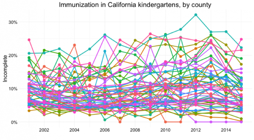
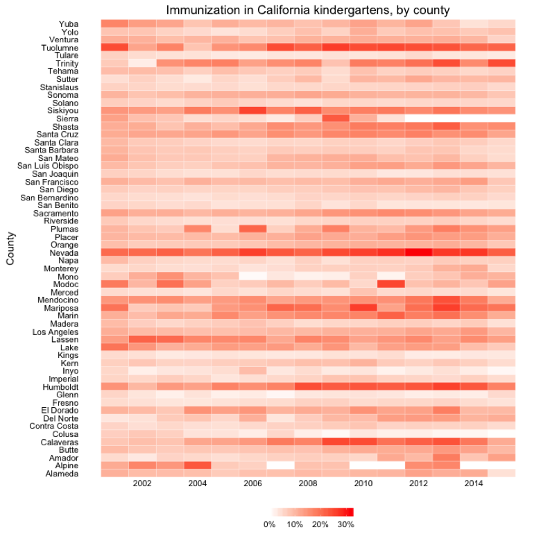
Knowing what you want to illustrate with your data may mean making compromises. Aldhous showed the comparison of several counties regarding immunization in California kindergartens. With 58 counties, a dot-and-line chart is visually chaotic and overwhelming. A drop down the perceptual hierarchy uses color intensity to better represent the percentage of incomplete immunization across the state. In this case, the granular comparison is exchanged for an idea of the overall pattern. What is lost in terms of ease of perception is gained in the overview of the data. But you can get creative with additional graphics and visualizations. “You’re not limited to one visual encoding,” explained Aldhous.
Don’t make our minds struggle so much
“Don’t make people’s brains work harder than they have to,” Kanik said. She and Aldhous both emphasized the importance of using color to both fit the data and make the interpretation of that data as automatic as possible. Choosing the right colors not only lightens the burden on readers, but it is also an important issue when designing for accessibility. Using tools like ColorBrewer ensures that your data visualizations also work for colorblind readers.
Keep it simple
While more complex visualizations like box plots may be good for those crunching the numbers and doing the analysis, they are typically too complex for readers. Supporting details and context are crucial for good information design. Annotations can go a long way for forming a story and guiding readers through the key points. Using white space gives time for the brain to process information.
Aldhous recommended sketching and experimenting with different encodings and visualizations in order to test them with different people. “They have to work instantaneously,” he said. He called for a shift from the mentality of “I’ve got this data, what’s the chart” to “I’ve got this data, what’s the story?” Because at the end of the day, the story is in the data.
About the author

