NICAR16: Visualization designed for the human brain

Data visualizations must tell a good story. But even the best stories might get lost in the translation to a chart, infographic, or map and end up in the dreaded WTF Viz hall of fame. In a session called “Information design for the human brain,” BuzzFeed reporter Peter Aldhous and MediaShift metrics editor and curator Allie Kanik highlighted different ways of encoding data and shared their tips and tricks for deciding the appropriate visualization for a given story that can be easily understood by readers.

Understand the perceptual hierarchy of visual cues

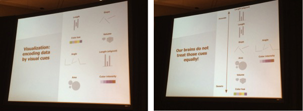
“Data visualization is the encoding of data by visual cues,” Aldhous said. “But our brains do not treat those cues equally.” He outlined a spectrum of visual cues in terms of accuracy, with aligned length as the most accurate (think of a bar chart) and color hue as the most generic. In information design, different tasks will call for different moves up and down the perception hierarchy.

Our brains interpret different types of visualizations differently. Length tends to be associated with accuracy (bar charts), while color is less so.

Know the story you want to tell

Knowing the story you want to tell narrows down the options for your visualization. For example, column charts, dot and line charts, and line charts are all good for showing change over time. But each one accentuates different aspects of the story. A line chart shows the rate of change over time, a column chart shows more direct side-by-side comparisons, and a dot and line chart is the best of both worlds because it shows both the trend and allows for comparison of individual years.

Manik explained the importance of understanding the difference between sequential and spatial learning. She used a New York Times graphic to illustrate the use of sound and motion to perceive the proximity of finish times in different Winter Olympic sports. “Sound is understood by the brain in sequence,” Manik said. She also used animated GIFs as examples of conveying information in a sequential and repetitive way for learning and understanding. This is because loops help explain complicated lessons through repetition. (And they’re fun!)

Make compromises

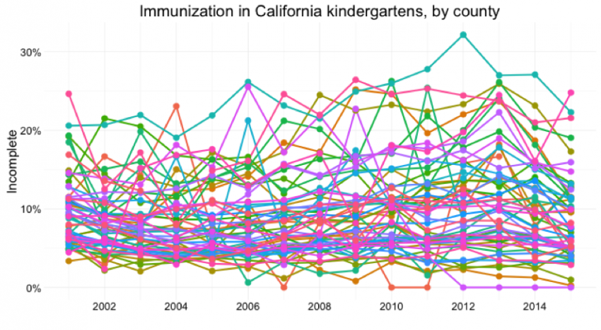
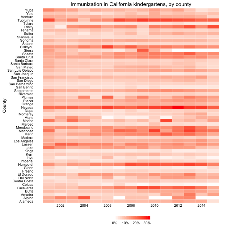
Knowing what you want to illustrate with your data may mean making compromises. Aldhous showed the comparison of several counties regarding immunization in California kindergartens. With 58 counties, a dot-and-line chart is visually chaotic and overwhelming. A drop down the perceptual hierarchy uses color intensity to better represent the percentage of incomplete immunization across the state. In this case, the granular comparison is exchanged for an idea of the overall pattern. What is lost in terms of ease of perception is gained in the overview of the data. But you can get creative with additional graphics and visualizations. “You’re not limited to one visual encoding,” explained Aldhous.

While this image is accurate, it's much more difficult to decipher than the one below.


This graphic includes the same data as the one above, but is much easier to interpret thanks to smart design choices.

Don’t make our minds struggle so much

“Don’t make people’s brains work harder than they have to,” Kanik said. She and Aldhous both emphasized the importance of using color to both fit the data and make the interpretation of that data as automatic as possible. Choosing the right colors not only lightens the burden on readers, but it is also an important issue when designing for accessibility. Using tools like ColorBrewer ensures that your data visualizations also work for colorblind readers.

Keep it simple

While more complex visualizations like box plots may be good for those crunching the numbers and doing the analysis, they are typically too complex for readers. Supporting details and context are crucial for good information design. Annotations can go a long way for forming a story and guiding readers through the key points. Using white space gives time for the brain to process information.

Aldhous recommended sketching and experimenting with different encodings and visualizations in order to test them with different people. “They have to work instantaneously,” he said. He called for a shift from the mentality of “I’ve got this data, what’s the chart” to “I’ve got this data, what’s the story?” Because at the end of the day, the story is in the data.

About the author

Nicole Zhu

Undergraduate Fellow

Interested in visual storytelling and building products for news. Studying computer science and English at Northwestern.

Latest Posts

  • A Big Change That Will Probably Affect Your Storymaps

    A big change is coming to StoryMapJS, and it will affect many, if not most existing storymaps. When making a storymap, one way to set a style and tone for your project is to set the "map type," also known as the "basemap." When we launched StoryMapJS, it included options for a few basemaps created by Stamen Design. These included the "watercolor" style, as well as the default style for new storymaps, "Toner Lite." Stamen...

    Continue Reading

  • Introducing AmyJo Brown, Knight Lab Professional Fellow

    AmyJo Brown, a veteran journalist passionate about supporting and reshaping local political journalism and who it engages, has joined the Knight Lab as a 2022-2023 professional fellow. Her focus is on building The Public Ledger, a data tool structured from local campaign finance data that is designed to track connections and make local political relationships – and their influence – more visible. “Campaign finance data has more stories to tell – if we follow the...

    Continue Reading

  • Interactive Entertainment: How UX Design Shapes Streaming Platforms

    As streaming develops into the latest age of entertainment, how are interfaces and layouts being designed to prioritize user experience and accessibility? The Covid-19 pandemic accelerated streaming services becoming the dominant form of entertainment. There are a handful of new platforms, each with thousands of hours of content, but not much change or differentiation in the user journeys. For the most part, everywhere from Netflix to illegal streaming platforms use similar video streaming UX standards, and...

    Continue Reading

  • Innovation with collaborationExperimenting with AI and investigative journalism in the Americas.

    Lee este artículo en español. How might we use AI technologies to innovate newsgathering and investigative reporting techniques? This was the question we posed to a group of seven newsrooms in Latin America and the US as part of the Americas Cohort during the 2021 JournalismAI Collab Challenges. The Collab is an initiative that brings together media organizations to experiment with AI technologies and journalism. This year,  JournalismAI, a project of Polis, the journalism think-tank at...

    Continue Reading

  • Innovación con colaboraciónCuando el periodismo de investigación experimenta con inteligencia artificial.

    Read this article in English. ¿Cómo podemos usar la inteligencia artificial para innovar las técnicas de reporteo y de periodismo de investigación? Esta es la pregunta que convocó a un grupo de siete organizaciones periodísticas en América Latina y Estados Unidos, el grupo de las Américas del 2021 JournalismAI Collab Challenges. Esta iniciativa de colaboración reúne a medios para experimentar con inteligencia artificial y periodismo. Este año, JournalismAI, un proyecto de Polis, la think-tank de periodismo...

    Continue Reading

  • AI, Automation, and Newsrooms: Finding Fitting Tools for Your Organization

    If you’d like to use technology to make your newsroom more efficient, you’ve come to the right place. Tools exist that can help you find news, manage your work in progress, and distribute your content more effectively than ever before, and we’re here to help you find the ones that are right for you. As part of the Knight Foundation’s AI for Local News program, we worked with the Associated Press to interview dozens of......

    Continue Reading

Storytelling Tools

We build easy-to-use tools that can help you tell better stories.

View More