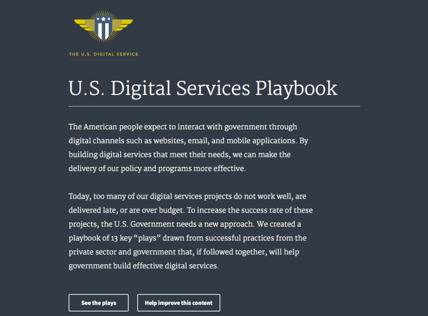
In September, 18F, a team of designers and developers within the General Services Administration (GSA), and the United States Design Services (USDS) released the US Web Design Standards, a project that aims to unite all government websites under a single set of guidelines that guides visual design and user experience. This idea of creating a brand focused on simplifying something as infamously monstrous and unfriendly as digital bureaucracy was ambitious to say the least, but the standards they created boiled everything down to serve four basic tenants:
- Make the best thing, the easiest thing.
- Be accessible out of the box.
- Design for flexibility.
- Reuse, reuse, reuse.
How well these standards will be implemented in the future is another matter altogether, but for now the standards provide a point of reference from which designers and developers can build accessible and intuitive websites for everyone to use.
These ideas are also something news outlets need to keep in mind as well, not only for their interactive pieces, but for their static content as well. It’s vital for media to engage readers with their work, and because there’s such a fine line between design and over-design, we are constantly challenged to create and refine new ways of communicating and establishing connections with users.
All of which makes 18F’s work instructive for journalists.
The need for a single source of truth on design and experience has been around pretty much since the beginning of the digitization of government record-keeping. After all, the Internet is a huge place, and without a document to provide guidelines and constraints on key things like branding, it can be very difficult to parse out what is and is not the correct place to be or the correct thing to do. Any large entity that people depend on every day like the US federal government demands a consistent experience for users who would be otherwise lost in what would surely be a motley of appearances, symbols and dictions.
This design need—the need to establish a consistent, simple way to communicate the most necessary information in the fastest way possible—is not new, and certainly not to governments. Similar challenges that come to mind include what can probably be considered the analog counterpart to the Internet: public transportation. And no system of public transportation is more universally praised than the New York subway system.
In the 1960s, the New York subway system was much like the government buttons that were used as an example of what the USDS was trying to fix: inconsistent both aesthetically and in wording, despite having in many cases similar functions and purposes. It wasn’t until 1967 when the New York Transit Authority hired Massimo Vignelli and Bob Noorda to create the New York City Transit Authority Graphics Standards Manual, a signage system for the subway that changed a hectic and disorganized mess into what it is today, recognized not only for the simplicity in its appearance but also for its ability to communicate the most important information the most easily and in a way that people would be able to understand over and over again. In other words, it accomplished all four tenants of the USDS.
Of course, there are some fundamental differences between the problems the USDS are hoping to solve and the problems solved by the Graphics Standards Manual. On the web, developing meaningful feedback to interaction is critical for people to understand whether the things they’re currently doing and the things they need to do are aligned, and interaction in general is a huge struggle to deal with when you have people accessing your resources on a variety of different platforms and with a variety of different needs. However, the basic goals remain the same.
And these goals are some that even some tech companies have only recently begun to realize. As John Maeda stated in his Design in Tech report earlier this year, the sheer amount of interaction we have with all our tech, especially our mobile devices, demands a heavy investment into crafting a practical, enjoyable user experience. Tech companies today run the gamut in how invested they are in designing meaningful and useful, from the relatively new IBM Design wing and Google’s Material Design language to Apple’s downward fall from good design.
The USDS most likely is not the endgame for the United States government. After all, the standards were put out after just four months of work and upon release in September was referred to as an “alpha” on 18F’s website. However, it serves as an important and meaningful gesture that the government not only recognizes that there has been a problem (something hard to ignore after such debacles as healthcare.gov), but is also working toward solving those problems in a way that allows as many people as possible to access the information they need as quickly and easily as possible.
Perhaps the best part of the USDS, however, is its openness. It’s currently publicly available on GitHub, and the creators actively encourage users to provide feedback and suggest changes to the standards so that they most accurately capture the experience of using government services online. The constant iteration means the standards are alive, that they can change to accommodate people’s needs and preferences, and that there is opportunity to change things that aren’t working and implement things that do. After all, as the saying goes, it’s not government work unless you do it twice.
About the author


